31/03/2016

Contextual Ref: Ingela P Arrhenius

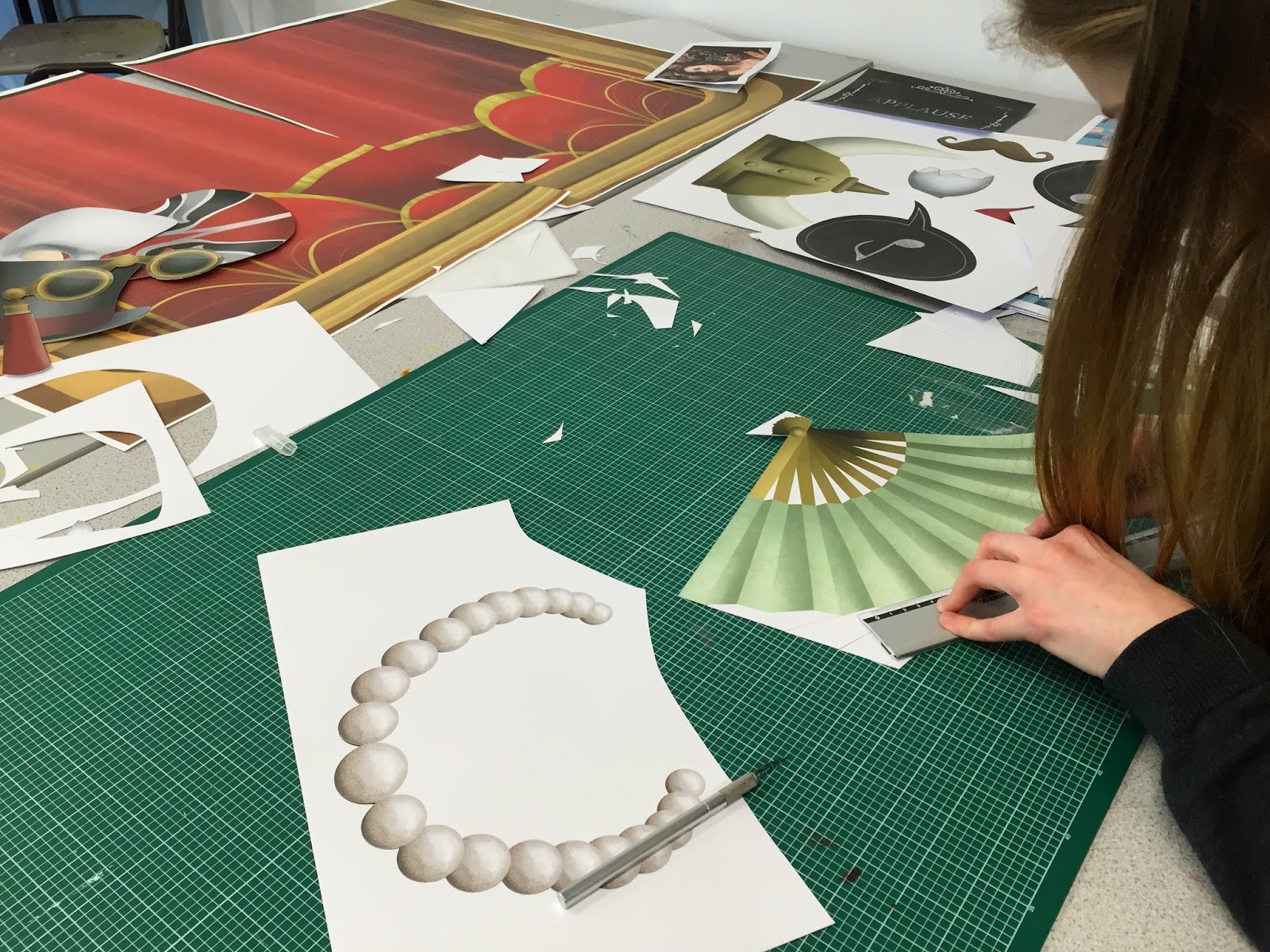
After the progress surgery with Fred, I've been thinking of ways I can make a game out of my paper cut characters. At first, I wanted to make a completely new game, inspired by things that happen in the illustration studio - e.g. finding out who stole the wacom pens (I had something like cluedo in mind), situations that are completely unique to our studio - but this would require sooooooo much more time to plan AND execute, which I don't have because I still my Final Major Project to do (which I haven't done much of since the tutorial w Fred, which absolutely worries me!).

Then I came across Ingela's memory card game set. I LOOOOOOOVE illustrations that are inspired by mid-century design! So when I saw this, I was instantly intrigued! Even though it isn't a completely new type of product, it is absolutely lovely. I love the shapes, the colours, I would buy it because of the 50s/60s design feel of it. Now I want to make a card matching game too! This wouldn't really require me to make new imagery - just another format to present what I have already - which is what Fred wanted me to do.

The square format also fits perfectly with the paper cut characters I've produced already! 
IT'S MEANT TO BE.

30/03/2016

Shell Scheme Graphics

The client decided that they wanted the colours to alternate between pink and black. They also wanted their logo placed after every 3 comics. Below is the final (10 X 2.5 m) version that they have agreed to go with (without the grey borders):


I'm a bit worried it might look a bit messy to be quite honest, and I have said this to them but they seem to like it A LOT, so what can I do eh? haha. Also, it might end up looking different once it's actually on the wall and interacting with the environment. I'm excited to see how it'll look!


Another brief completed! wahoooooo!

29/03/2016

AB Comic 3!

Last one! wahoo!


Wall dimensions:
Side (Left) : 2.5m (h) x 3m (w)
Back wall : 2.5m (h) x 4m (w)
Side (Right) : 2.5m (h) x 3m (w)


waiting for approval..

27/03/2016

Booklet Ad

So they've decided they wanted grey with pink elements, and they seem to like this new version (below) however, I'm not sure if I like it myself. I think it works, but as separate images - if they were to be displayed on their own and not in a sequential way like this. Firstly, the shade of pink is not something I would personally use, but it's the pink in their logo so it would make sense to use it. Second, it just looks a little messy to me, but I guess it's what the client wants.. Below is the ad they will be having in the MEFCC booklet. I think I might tell them that for the large wall version, they should just stick with monochromatic colours otherwise it will look a mess in my opinion eeeeek!

24/03/2016

Refining sketch 2!

I'm finding this one much easier/quicker to do since most of the frames are close ups! For this one the client specifically told me that they wanted a hijabi as the main character, and that the ball is a masquerade ball. Maybe I should do some research on being an illustrator in the fashion industry too, since I'm enjoying this A LOT! or maybe its because of the process? it's a much simpler process than my usual one - probably one of the reasons why this feels less stressful lol.

23/03/2016

Refining sketch 1!

Really miss working with line! I'm enjoying this a lot!


The lines were originally done in back but I thought it looked a bit harsh against the white background so I lightened it up a bit and now it's a little more grey:

I wanted to see how it would look in a different colour. I thought pink would look nice/appropriate for the brand as their previous promo materials have had pink in them:

I showed the client both versions and they love both! haha so I'm not sure which one they want as the final yet.

17/03/2016

Progress Surgery Feedback

The tutorial was really useful. After some reassurance from Fred, I feel like I am on top of things and going in the right direction with all my briefs. I have finished 4 briefs so far and have 3 more to go! These briefs are:

SB1 (final major project) - To be honest I still don't know what I'll be producing as the final product for this. For the pop-up book route, there's nothing bad about keeping the story simple, but if so I have to focus on making the pop-ups really amazing. Fred suggested I concentrate on making the characters on point first though and not worry about what the final product will be yet (because he believes this is why I'm getting all confused) - how will I convey their personalities? what is this world that they live in? Since I want to be a character designer in the animation industry, I think it's wise I sort this out first! I think once I've figured out the characters and done more sketches of them interacting with each other and the world around them, a more solid story will come naturally from this.

SB4 (paper portraits) - My concern with this brief is not having enough time to complete all of my paper portraits. Fred pointed that I've already done all the hard work, and he knows that I work quite quickly so he thinks I can do it! He also told me to push the scale and format with this brief - think about other products that I can produce from it instead of taking the easy way out and putting things into books - making it into cards that people can collect? make a game out of it (like Guess Who?)?. Fred told me that I have placed myself in a position where I can/should take risks and not be afraid if it fails! (same goes for my final major project).

SB7 (ayasoB) - All there is to do now is digitise the comic strips, making sure that it would print ok at a large scale. Aiming to complete this next week, as the deadline for it is end of March. Completed on 30/03/16.

YCN Submitted!

16/03/2016

Updated SOI and Briefs

Spring break checkpoint / progress surgery prep.

Things to mention / questions for Fred:

OUIL603
  1. Check YCN boards - okay to send off? should we add names? (we've tried putting our names on them but they don't look good).
  2. I want to focus on my final major project after Easter so I'm a bit worried about time left to complete all the paper portraits for Brief 4. Incase I run out of time, can I submit a digital mock up of the book instead of submitting the physical copy (like what I did last year with Charlie's Kidney Transplant for Responsive)? Will try to complete the project before end of year though, as people are actually interested in buying a copy!
  3. Want to hear your opinion on my final major project (Brief 1). Is it a good idea? am I making things difficult for myself. advice / suggestions?
  4. Overall, am I making good progress so far on 603, considering we have 9ish weeks left (minus 10 days for me because of comiccon).
  5. Project Report - same format as last year's responsive one? Planning to get started on this during those 10 days (when I won't have access to the studios etc.) for the projects I've already completed.

PPP
  1. Creative presence: is website and business card enough?
  2. Physical portfolio: is the size, format, page orientation up to us? (because I think I want mine landscape)
  3. Blog: Is there anything you suggest I do that I haven't done? 
  4. I won't get penalised for posting over 100 posts will I? hahaha
  5. Any other comments/suggestions?

Contextual Ref: J. Otto Seibold


THIS ON-LINE TREAT was put together to help Scholastic Books promote J. Otto Seibold's pop-up book, "Alice in Wonderland."

15/03/2016

ROH Presentation Boards

Shoot and edit!

Today me and Becca got our photos sorted out (thank you to those who participated)!


Initially, we were going to go with the above photo format as I thought it would be a good idea to incorporate the image from one of our posters to it (to make it look like it's from the same campaign) however, I found that this looked really messy and just not good. So we've decided to go with the popular long photo format. Me and Becca have also come up with a hashtag! - for social media purposes.


It was hard choosing which photos to use, but it's done! I've cropped and edited the photos a little bit. Also started figuring out layout of our presentation boards! Tomorrow we will be meeting up again to write out the explanations of our idea, which is the last stage before submitting to YCN!

14/03/2016

Photo Booth pictures

Today we printed our Photo Booth props and backdrop! (see Becca's blog for development on this). I really love them, especially the backdrop - SO GOOD! We saved a bit of money too as we brought our own paper. It only cost us £5 to print 2 A1s and 3 A2s (+£1.20 for paper) - we split the cost between us so it's fair (£3.10 each). We were originally going to buy bamboo skewer to stick our props on, however I suggested we go down to woodwork first to see if they have some unwanted pieces of wood (which we found that they have plenty of!). The guy from woodwork also cut them into thinner sticks for us - all free of charge, of course!


Next on our to do list is to take the photos and make some presentation boards, which will explain our idea, to send off to YCN! We're aiming to get this done by Thursday before our progress tutorials with Fred! Everything is finally coming together! I'm excited!

ayasoB Comic layout 2 & 3

Here are two other scenes/comic layouts - The client wanted one where the character is having a bad day then ends up in field of flowers with her ayasoB kimono outstretched behind her. For the final one they wanted one where the character makes a 'Cinderella entrance' - pretty vague and random but I managed to come up with something:


I've sent the client all three sketches and they all have been approved! Really glad that I got everything right the first time, as that will save me so much time! YAY! Next stage is to refine and digitise them, so it's ready for some large scale printing, which I'm really excited about!

The Serengeti

The Serengeti ecosystem is a geographical region in Africa. It is located in northern Tanzania and extends to south-western Kenya.  It spans approximately 30,000 km2 (12,000 sq mi). The Kenyan part of the Serengeti is known as Maasai Mara. It is named in honor of the Maasai people (the ancestral inhabitants of the area).

The Serengeti hosts the largest terrestrial mammal migration in the world, which helps secure it as one of the Seven Natural Wonders of Africa and one of the ten natural travel wonders of the world. The Serengeti is also renowned for its large lion population and is one of the best places to observe prides in their natural environment. The region contains the Serengeti National Park in Tanzania and several game reserves.

Approximately 70 large mammal and 500 bird species are found there. This high diversity is a function of diverse habitats, including riverine forests, swamps, kopjes, grasslands, and woodlands. Blue wildebeests, gazelles, zebras, and buffalos are some of the commonly found large mammals in the region.

These are the animals that I would like to include in the book, but not sure whether they will actually all appear in the book (I'll try though):

  • Giraffes
  • Zebras
  • Lions
  • Elephants
  • Cheetah
  • Ostrich
  • Rhino
  • Baboon
  • Oryx/gazelles
  • Hippos
  • Wildebeest
  • Hyenas
  • Warthogs
  • Meerkat

Sketches:

11/03/2016

Posters


I'm having a bit of a dilemma with the colours. At first, we decided to go with the red and gold theme because the opera house if full of reds and golds and it worked when it was just the two posters. However, I've made a third one - I've tried a couple of colours for it and asked Becca what she thought. We both felt that they just don't look like a set when they're all different colours. Then I decided to see what they all would look like with the same colour (red) and we found that this just tied everything together! So now we are going to change them all to red.

09/03/2016

Screen print 2nd attempt

I decided to go a smaller size this time, because I find that it's so much easier for me! I also decided to change the colour of the stock - at first, I printed white on coloured stock, however this didn't show up very well and so it didn't really look that great. I inverted the positive for this layer so I would be printing the pink instead of the white:


The results were much better than my first attempt, however I still feel like it could have come out a bit better. I made the last layer more opaque, but I guess it wasn't opaque enough as you can still see the trees coming through the supposedly solid colour. I think I'm going to make a couple more prints and then going to move on to screen printing the other two designs:

08/03/2016

Research: Interactive Books

I saw this kid's book and I really love all the interactive features! I'm currently thinking of ways I can make my book interactive too and I'm really liking the tangible/removable parts in this book which helps to put the child reader in the driver's seat of a taxi cab. Like, literally. The readers are given the chance to operate their very own car. They can check their tire pressure with a removable gauge, look in the glove compartment, adjust the mirror, and even place the key in the ignition.

In the previous crits, I was suggested by Patrick to look at not only pop-ups, but pull tabs and lift-up-flaps too. This way I can make my book more interactive. I think this is a good idea and I'm going to consider all of the possibilities (including removable parts), but I feel I can't really do any tests yet because I need to get the content/story all figured out first!

Step-by-step how to

Recently Adam let me borrow his mother's book of step-by-step paper engineering how to! I'm excited to start playing around with pop-ups and making them my own! I just need to get the story all sorted first! this is the only thing slowing me down - I still want to keep it to a few pages/really simple sentences because I want to try making the pop-ups really amazing! I need guidance.

Group Progress Crit

Aaron and Joe's feedback:

 Jamie's feedback:

Self-evaluation.

I think the idea and research into story overall is good so far. I feel it is quite big and ambitious for the time I have left of this module, however my peers think I can do it! I need to keep developing my characters - further explore how they move/speak/feel to capture a personality. In the crit I expressed my concern for the actual manufacture of the book - mainly about the printing of the pop-up pieces - as if I were to print double sided, I would need to make sure that the images are exactly centred and in place (which sometimes is not in uni and I can't afford to waste money and time - if I can, I'd really like to get it right the first time!). I asked whether it would just be enough if I concentrated on making a standard pop-up book instead of a 2 in 1 book and play mat. The majority of people in my group, including the tutors, thought that if I feel it is too much, it's better to make the book and play mat as separate products - but get the story and the book right first because this is the backbone of the project. Everything else that is produced from it will be additional merchandise to keep the main product (the book) relevant. So I think this is what I'm going to do now. I need to edit the story - make it really exciting - and finalise this as soon as possible. Once this is figured out, I can then get really stuck in with the visuals and the mechanics of it all by doing pop-up developments/tests and trials.

Action Plan:
  1. Continue to develop characters - show how they interact with each other.
  2. Spend time with animals and environmental design - push the aesthetic.
  3. Spend time developing story - get this finalised (or as close to finish) as soon as possible.
  4. Thumbnails for book and pop-up plans.
  5. Do tests for pop-ups.
  6. Finalise illustrations.
  7. Print & assemble.

07/03/2016

Animals in East African Mythology

from thomsonsafaris.com

Every child who has ever read Aesop’s fables knows that the crow is smart but arrogant, the fox is sly but easily flattered, and the hare seriously needs to work on his time management. In many cultures, animals in folklore stand in for common human types, and certain animals reliably play a certain role: the clever trickster, the foolish oaf, or the cruel tyrant.

East African folklore is no different; African folktales are intended to teach people, particularly the young people, about life lessons and ways they should conduct themselves in order to succeed in life and love. Animals played a prominent role in African myths due to African people having lived in close proximity to the wild animals that shared their land. In Tanzanian mythology, the following animals tend to get typecast:

The Hare = The Trickster

Trickster figures are a staple of folklore traditions all over the world; there’s something both instructive and viscerally satisfying about seeing a smaller, weaker, but cleverer creature defeat a strong (but gullible) opponent.

The Crocodile = Vicious and Violent

Symbols of destruction and cruelty, crocodiles are defined most by their selfishness. They may act nicely towards another animal in a story, but never without a self-serving motive.

The Hyena = Greedy & Shortsighted

Though they’re often seen as clever, their greediness will get in the way, and their attempts at instant gratification often backfire spectacularly.

The Lion = The Oppressor

They call him the king of the beasts, and like kings in fairy tales, the lion is often imperious, demanding that other animals pay him tributes, terrorizing villages, or otherwise throwing his (royal) weight around.

The Elephant = An Easy Dupe

In reality, elephants’ intelligence is truly astounding; their capacity for reason, empathy, and long-term memory have all been well documented.


In East African folklore, however, their massive size and lumbering gait get them cast in the role of resident oaf. Hare often tricks simple, passive Elephant, even though Elephant has rarely done anything to deserve it.


06/03/2016

ayasoB Comic layout 1

The client have told me that the character doesn't need to be too detailed as they want to use more back shots and side views. They have also provided me with 3 scenarios, which will become 3 mini comics:


Here is a really rough sketch of 1/3 scenes! I've added a few extra bits and pieces on top of the imagery that client wanted just to make the sequence a tiny bit clearer. I actually really enjoyed this! It's kinda like storyboarding - which is a job that I have considered in doing within the animation industry and something that I've been wanting to practice for a while now. Anyway, if it isn't obvious, the character leaves the office, makes her way to her car, drives away, parks, opens trunk of her car, takes out her ayasoB shopping bags and then poof! she struts out in her ayasoB kimono. I've sent this to the client and awaiting approval before going any further.

04/03/2016

Minor Adjustment


Here I've changed 'Reflect' to 'Find' but I'm finding the type so difficult to do! I feel like I don't really know how to do anything else other than to use my own handwriting! I hope it's okay though.. I'm going to ask which people think fits better for the poster.