29/02/2016

Visual Dev - Environment Design

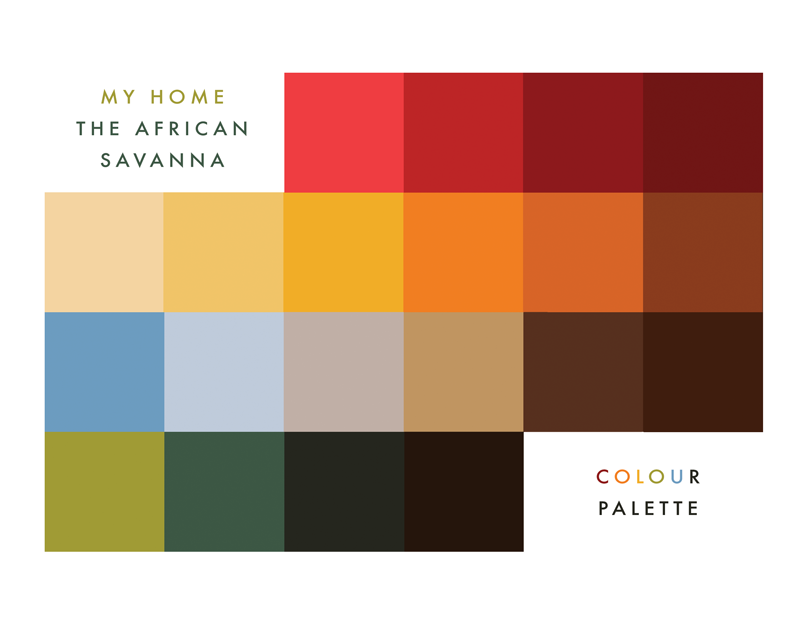
The Savanna is mainly grassland and small bushes but there are also trees. They can’t grow close to one another in bunches because the ground is made of a hard layer that is created by the hot sun in the summer and the water in the wet season which stops roots from pushing downwards to get water. This means that trees can grow only in cracks. The major trees of the Savanna are the Acacia trees and the Baobab trees. Another well known tree is the Candelabra Tree.


Digital studies:


The Maasai live in Kraals arranged in a circular fashion. The fence around the kraal is made of acacia thorns, which prevent lions from attacking the cattle. The inkajijik (maasai word for a house) are loaf-shaped and made of mud, sticks, grass, cow dung and cow's urine. The frame is made of timber poles fixed directly into the ground. These are interwoven with smaller branches and twigs placed closely together to form a matrix. Wood from the oiti tree is used, because it resists termites (destructive insects) and grows in both highland and lowland areas. The roof is overlaid with dried grass. Soil, cow dung and ash are mixed together to form a plaster for inside and outside the house. Small in size (just 3m x 5m x 1.5m tall), an inkajijik provides space for cooking, sleeping and some storage.


Digital studies:

Visual Dev - Character Design

I found this picture on Pinterest and it's perfect! The little kid is around the age I pictured Kito to be (maybe just a teensy bit older), so I'm going to base him and his dad on this picture.


I recently bought Never Tickle a Tiger by Pamela Butchart, illustrated by Marc Boutavant:


I really love the way the characters are drawn in the book - their wide, large eyes in particular - like they're full of wonder, amazement and curiosity, and I love that because I feel that children look at the world in this way all the time! I decided to let myself be inspired by the way Marc draws his characters. below is the result!

23/02/2016

Progress Feedback

Tutorial with Patrick was really good this morning! He gave me lots to think about and gave me tips/things to consider to make the project more exciting for the target audience. I came out feeling more confident about the project and I'm excited to get going!

Issues discussed at the tutorial:
  • How interactive is the book going to be? make it a game? include pull tabs etc. with extra info/imagery so that the kids can really immerse themselves and discover new things as if they really were in the Savanna. - a pop up within a pop up?
  • Story is good so far, but can be further edited - is it about the senses - being aware of their environment. Include jeopardy/danger/adventure.
  • Get rid of the first two lines and make "Race you to the waterhole!" the title? - adds a bit more excitement/adventure - Would grab more attention.
  • Do we see the humans - how? How do they interact with the environment and ecology? make them into finger puppets so that the reader can literally become the characters?
  • Do the animals have folkloric characters? give them voices and names to make it more exciting, whist also incorporating more of the african culture though folktales.
  • Look further into pop-ups - the watering hole to a mountain range backdrop. 
  • Start visualising - sketch, draw!

22/02/2016

Colour Palette

I signed up last minute to talk to Ben about all my 603 briefs today - I also have one tomorrow with Patrick - I just thought it'd be good to get as much input as possible. Ben suggested that I start generating some colour palettes and sketching out some character designs for my big project. Here, I used Adobe Kuler to generate some colour palettes based on traditional African paintings and photographs of the African Savanna.


These are the colours that I will use as a starting point. Usually things change half way though the production - Usually I adjust colour and values until I am satisfied with the image.

16/02/2016

Target Audience

I've gathered a list of UK Children's books publishers for PPP (potential contacts/people to invite to the end of year show). I've also had a look at their websites and the kind of books that they publish - Ladybird have their books categorised into Age & Stage, which is great because I am going to use this guideline when I make children's books from now! Knowing the age groups give me clearer sense of the audience I ought to target for my pop-up book - and also for it's additional products/merch.


I've decided that my target audience is going to be 5-7 year olds - mostly because they'd have better understanding/appreciation for pop-up books but I can still keep the language quite simple.

15/02/2016

Additional Product Ideas

If I have the time, I'd like to create more products based around my pop-up book/the African Savanna. I came across this Yoga for kids range and thought that it's a good way to expand on the product. Once my book is made, I think the pictures in it could be applied easily to other products: a-z poster, colouring book, flash cards.


Then I came across this Fairy matching game and thought I could make something similar to this as well. To make mine a little different, I thought I could make it so that they'd have to match the animal on the card to the Swahili name of that animal on another card. As well as helping develop children's memory, concentration, and identification skills, they can learn a little bit of the language too!

13/02/2016

Pop-up References

I started collecting some images of pop-ups on Pinterest to help get those gears going in my head. I'm mostly interested in the pop-ups that work when the book is opened up fully - because if my book is also going to be a play mat, I need to create ones that work when its laid flat. I'll probably start experimenting soon and using these examples and modifying them to help me get started with my own pop-ups! I'm quite excited!

12/02/2016

Potential story?

So this little story suddenly popped up in my head.. I don't know if I'll use it but I'm going to write it down..


My Home: The African Savanna

1.
It's amazing,
Kito* thought, when the sun is blazing.

"Race you to the waterhole!"
he shouted, as he ran out the door.

2.
"Stop!" Papa warned, 
when he spotted two sharp horns.

"You must never startle an oryx" he puffed (catching his breath),
"as it may run directly in your path!"

3.
"Whose footprints are these?" Kito pointed at the ground.
"They only have two toes!" he frowned.

"They belong to the heaviest bird in all of the Savanna." Papa laughed with delight.
"The ostrich is so big and heavy, that it's wings won't even support him in flight!"

4.


5.
"And what is that, Papa?" Kito asked,
when he saw movement in the tall golden grass.

"Shhh.." Papa whispered,
"Let's hurry now, before the lions wake from their slumber".

6.
Kito was surprised when they reached the waterhole.
A (large) gathering of animals was what he saw.

He wondered if there was a sight more wonderful.
He loves his home with his heart and soul.


*Kito is a Swahili boy's name meaning precious.

ROH Idea change.

I wasn't feeling confident about making an animation for our ROH brief anymore because of the amount of work I already have piling up and the time we have left until the YCN deadline. So Becca and I decided to have a little meeting to discuss other alternatives. We've decided that we are still going to produce some posters (which I will now be in charge of). Because I'll be in charge of the posters, I wanted something else that can really showcase Becca's skill. I think her motif/pattern work is really strong (and I think she'd enjoy doing this type of work more), so we decided to think about how we can incorporate this type of work with the concept we've already come up with.

After much thought and consideration, we've agreed on another idea (which we believe is more appealing and engaging for the target audience)! We've identified that people of this age group really value friends and making memories - why else are they always connected online, through Instagram, Facebook etc.? 

Though not entirely new, the idea is a fun photo booth with opera related props - where people can 'dress up' and 'Reflect Your Inner Opera' (our tagline) with their friends. Becca will be responsible for the making of these props and the Photo Booth backdrop. As people usually share their Photo Booth pictures online etc. we will have the ROH logo on it to increase awareness for the branding.


10/02/2016

Book Launch Display

I may be getting ahead of myself here, but I thought I could also design displays for the book launch. I think that'll be pretty fun to do! I can imagine big cut outs of African animals and things!

Book Format


Whilst doing my children's book research, I came across this pretty cool 2 in 1 pop-up book and play mat! and it got me thinking! Last year I made some play pieces to go with my dance themed informative/activity book - initially I wanted to make the backgrounds too, environments in which these play pieces could be used within. However, I did not have enough time to do this.

I think creating this 2 in 1 book/play mat for this project would allow me to re-explore my 505 play set idea. After finding this, a story sparked within me! This probably needs developing but in its simplest form, the story will be about a father and son on a journey to fetch some water from the watering hole (if you were Masai, you would have to walk long distances to find a water hole) - Through this journey they will meet the animals they share their home with - the readers will also learn about them in this way. The initial title for the book is My Home: The African Savanna - this way I would be able to adapt it easily if I were to make a series of books based on different biomes (as discussed in previous post).


The mat will act as a map of their journey through the Savanna. Each of the fold will have a pop-up of the animals they meet along the way and at the end, will be the watering hole. Play pieces of father and son, and extra animals will also be provided for endless fun! Need to think about how I would produce this in Uni. hmm..


I haven't really figured out the details yet, but I think creating 6-8 pop-ups (probably 6) is achievable for the time I have left of this module. 


The Maasai tribe speaks Maa and are also schooled in English and Swahili (the official languages of Tanzania and Kenya). I don't know how yet, but I thought it would be nice if I could incorporate some Maa or Swahili in the book - this way the readers could learn a little bit of their language.

Research

There are a lot of different animals in the African Savanna! - I've decided to narrow it down to the animals we recognise the most. I found this video online and I think I will use this as a basis for the storyline and the animals I use in my book.


The Masai

The best known people of this habitat are the Masai. The Masai are a number of groups who share the same language and cultural and social similarities and who live scattered between Kenya and Tanzania.

These people have plenty of traditional customs dating back to ancient times: from religious ceremonies to the initiation of young warriors. Men wear their hair long, arranged in thick locks mixed with red ochre and animal fat, while the women, the old and the children must be thoroughly shaved.

The traditions of the Maasai are being engulfed by the ever increasing western influence, attracting many of the younger Maasai to forego their tribal ways in exchange for more comfortable and convenient western living. However some of the more rural tribes living in the Mara’s dispersal areas still practice their ancient ways as semi nomadic pastoralists.


African Savanna

I've decided now to change the content of my children's book (again haha, when will it stop). It will no longer be the topic I previously proposed (I will keep this my post-graduate project, as originally planned - might also be working on this with Lauren for SchoolCycle).

However, I still want to explore people and places in Africa because it's something that I've not done before and would therefore allow me to venture outside of my knowledge and usual comfort zones - colour palettes, character designs etc. Also, I like the idea of taking myself and young readers to faraway places and learning about different cultures, because this is one way that children can see the many ways people around the world are alike.

After giving this a bit of thought, I've decided that I am going to make a children's pop-up book about the amazing animals and people of the African Savanna! As there are already a lot of information about this on the internet and in books, I wouldn't need to spend so long doing research and can spend more time with the crafting of the illustrations and the book.

To expand on the range, I could also then propose to make more books based on different biomes:

  • Arctic
  • Desert
  • Cave
  • City
  • Coniferous forest
  • Tropical rainforest
  • Pond
  • Ocean/Coral reef

Rethinking Idea

The group peer review with Fred yesterday, was quite eye opening for me. I realised after talking about my idea and listening to what other people had to say about it, that need to think more outside the box. I feel that I need to think about how I can make this one more innovative, otherwise it won't be any different from the children's books that I have illustrated already! Making it more interactive was something that was suggested to me, looking at different formats than just a bog-standard children's picture book could really help to push my skills and this project along.

Today I decided to go out and do some research. I went to a couple of bookstores and had a look around in the children's section. Firstly, I looked at the educational books that are already available, as I want my book to be somewhat educational too. I wanted to see if they have any that provides the reader with not just knowledge but also with the element of fun, and how they have done this. I came across a couple of science pop-up books and thought this was a good way to keep the readers interested in what they're learning and the hands on, three dimensional diagrams makes explaining things more easily.


I was quite excited with the idea of making a pop-up book, so I had a look at a couple of others and there are some really stunning ones out there - Robert Sabuda's The Little Mermaid was one of them! After thinking more about it, I am now leaning towards making a pop-up book as this would also further develop my paper crafting skills. However, if I were to do this, I feel I would need to deal with a topic that is less intense, where information is readily available through the net or books, as I feel that I won't have the time to do completely new research whilst also learning to make nice and complex looking pop-ups.

09/02/2016

Screenprints

Finally made some prints today! Yesterday was spent on prepping the screens and getting the colours mixed. I also did some test prints with one of my screens but they didn't turn out as well as I'd hoped because the screen was not properly exposed, so they were all blotchy. I decided to try again this morning and asked Lyndon if there was a way to resolve this without having to clean and re-expose my screens. Fortunately, there was! he told me to use the power hose at it's lowest level (and not too close) and go over the areas that have been exposed to get rid of those last few stubborn bits on the screen. Here are the results:


I don't think they turned out that great to be honest, but at least I didn't just give up! Firstly, I think I need to find better stock that will absorb the paint a bit better. I did my tests on brown sugar paper and the prints on this turned out better than on the paper I bought myself. Secondly, I think the I need a darker shade of pink for the stock as this will really bring out the white and the sun. Third, I need to add more paint to my medium for the last colour to make it more opaque. I will find some new paper and try again soon, whilst the print room is deserted!

08/02/2016

Fourth Double Page Spread!

Here is my final double page spread (for this module, will complete the whole book in the summer). I decided to illustrate these texts instead of what I said initially because I thought it'd be nice to showcase as much characters as possible, even if I am submitting only four double page spreads. In the manuscript's extra information section, I was specifically told that Layla is a girl from a Muslim family and that the nurses on the liver ward wear a light blue uniform.


All four pages together!

07/02/2016

Third Double Page Spread Complete!


I was told to recycle any images where appropriate to speed up the production process. So for this page, I used the drawings from the previous book but I made it appropriate for LLT. I cringe every time I look at the font in CKT. Like, why did I ever use that font? and why so big?! I will never know, but it's quite ugly.


I decided to edit the page a bit more, to balance out the composition:

06/02/2016

Screen Print Prep

I still remember how to bitmap! Here are my positives, ready to expose! Going to get my screens and paint ready on Monday hopefully! I'm going to test out one design first - the mountain climbing one - and see how that turns out before doing the others. I went to the shop in the library to see if they have the right shade of pink for the stock but they don't, so I bought some today from Hobbycraft. I'm excited!

Final Tee Designs


Additional products:

I am really pleased with them! They look pretty good together!

Paragliding


Showed the client the designs I've done so far, and I was told that they wanted more mountains so I've done just that with this last design! I recycled the trees from the previous design, but I think it looks alright. Really had fun doing these! It's been a long time since I played around with complete flat colours, no textures! good brief for a bit of a breather. yes. Now I can't wait to get these screen printed, it's also been so long since I was in the print room - I shall go make the positives now and hopefully get some screens ready on Monday!

05/02/2016

Scuba Dive Design


At first, as shown in sketch, my idea was to have the fish in the foreground going around the diver. However, that didn't look good - it looked so messy! So I gave up halfway with that composition and decided to go for a simpler shape like my mountain climbing one - I don't think it's as strong as my previous design, but I think it's better than the first idea I had! Again, I ended up using 4 colours here haha.

Talking to Lauren!


OH MY GOSH! LAUREN AND CO ACTUALLY WANTS TO PARTNER UP WITH ME!
Nothing is set in stone yet, but before we embark on this project she wants to make sure she can get funding from the UN Foundation or through another organisation to compensate me for the production of the book! She's going to Dubai tomorrow, where she'll have access to the CEO, Kathy Calvin. She also has a book agent, who she's going to have a talk with on potentially selling to a major publishing house in the United States - these are her specific words by the way, I recorded our convo haha - which would be absolutely amazing!

She also talked about making sure that I would get publicity as well, as another 'payment' I guess, since the portion of the proceeds from the book will go to Malawi to support the girls/school there (which I have no problems with, as the whole point is to raise money to help). For this she said she's going to talk to her news organisation (the ground truth project). AAAAH!

damn girl. how did I get here?

Mountaineering Design

(my logo won't actually be there once printed)

Ah this was so fun to do! repeated shapes no texture! block colours and a bit of gradient, which I will need to bitmap! I said I was going to use 3 colours but ended using 4 colours here (really dark purple, dark purple, dark pinkish-purple and white - the stock is the pink colour. I'm not sure which one to make my final one. with the sun or without? I'm going to go and ask some people!


I've decided to go with the sun as it balances out the composition! Ahh I like it! I will be sending the client the design with transparent background (really dark purple areas - except for the person - will be transparent)

AyasoB Shell Scheme Graphics


Here is a new brief I received recently from a regular client (lol, so weird saying that). This time they want me to design a character wearing the AyasoB kimono and creating a comic around her for their shell scheme at MEFCC (similar to what I did for them last year). I am free to use whatever style I am comfortable of working in, it'll also be in black and white (but maybe 2 colours if time permits). So I think it'll be a relatively quick and easy brief to do and the deadline isn't until the end of March so that gives me plenty of time. Like most of my other briefs, this brief will allow me to improve my character designing skills, whilst also trying out making a comic, which I have never attempted in my life. so that'll be interesting. They have sent me some references of the kind of thing they're after too:


the comic strip will be repeated like this:

I was also told to include their logo on the top left corner of the comic strip like so: