

Studio Practice
29/10/2013
Photoshop
22/10/2013
Photoshop Induction - Colour and Texture
This week Steve taught us how to apply colour and texture to our drawings:-

 |
| scanned in coat |
By having the new layer set to multiply, we were able to apply colour over the top of our drawing. Here I scanned in my coat to get the texture for the background.
19/10/2013
Initials Brief Final Poster Process
 |
| Watercolour and pen ink |
 |
| Close up |
Adjusted, scanned in images:


Combined final outcome:
 |
| VOILÀ! |
Initials Brief Final Poster and Evaluation


Here is my final poster for the initials brief (right: A2 scale. Left: before digitally printed onto A2 stock). My design is an interpretation of my partner that communicates forward 3 elements of her personality; coffee lover, guitar lover and her innocent persona. I chose to communicate only these three out of the other 6 elements that I picked out as they were the ones that I thought stood out to me the most during the interview workshop and in the idea generation process. I decided to choose this design of my partner playing her guitar as it was said by my peers in the previous crit session that this was the strongest design out of the others I had on display. The reason they gave me for this was that not only does it convey her love for her guitar but it also captures her innocent personality because of the character's pleasant and angelic appearance. It was also suggested in that same crit session that I add more depth to it by the application of darker tones and/or textures/marks/patterns which I have incorporated into my final design. With the coffee beans idea, I decided to integrate it in the form of a boarder or frame to bring the final image together.


18/10/2013
Initials Brief Development (Cont)

15/10/2013
Photoshop Induction
Today in our Photoshop class I learned how to clean up, adjust levels, curves etc of my scanned drawing to get a more simplified, clear image. Below is the before and after of the drawing that I scanned;


I first selected the greyscale mode and used the spot healing tool to get rid of any dust and unwanted marks. I made the whites whiter and blacks blacker by adjusting the levels and curves and to further enhance the lines I increased the threshold slightly.
Initials Brief Development

From the sketches of ideas that were produced on the 2 A2 sheets, I selected 6 of my favourite designs and blew them up to A5 size. The purpose of this was to help see how these little designs would look when enlarged more than twice its original size and to see how this would affect the look of the media I used.
My peers from my crit group thought that the design of the girl playing guitar was strongest because they felt that it is framed well, looks charming and the look of the girls face is pleasant which also communicates the innocence of my partner's personality as well as her love for her guitar. I also asked how my strongest design could be improved and they suggested that I add more depth to it by adding different tones and more textures/marks/patterns.
Initials Brief
This is the 2 A2 ideas sheet that was repeatedly folded to get a total of 64 rectangles. The purpose of this was to help us quickly generate lots ideas and we were also encouraged to be quick with our sketches. In these rectangles I quickly drew out ideas from the words that I selected that I thought would describe what my partner is all about from the response I gathered of her from the interview.


I found coming up and sketching up my ideas quickly quite a bit of a challenge as I'm used to spending time adding details to them. However, I now know that this isn't necessary at this stage. I still feel that this grid method did get me to produce a good amount of ideas than I would have just doing it on a normal piece of paper or a sketchbook because I feel that I work best when things are more structured.

07/10/2013
Summer 10 Extended
My A1 ideas sheet for the extension of my summer 10 brief;

After receiving feedback from my peers, I decided on the idea of an illustrated guide to making doughnuts the imaginary way. I first did some brief research on the steps of doughnut making and started to sketch out possible designs that would explain each of these steps. I then looked at the possible layouts and sketched out a rough drawing of how my final piece should look at the end.

 I then started to look at media and process and found that I really liked the ease of colour blending that colour pencils allow and the effect and texture that it gives to my work which I ended up using so that it would match the textured appearance of my 8 10x10 cm illustrations. The idea of working on tracing paper came to me by accident when I tried using acrylic paint and failed. I found it difficult to create details and fine lines with this particular type of paint so I decided to layer it up with a line drawing of the rhino I had already done beforehand on tracing paper. This created an interesting look which resulted in me experimenting this further with colour pencils.


The feedback I received from the peer review session were;

06/10/2013
Summer Project 10x10cm
During the summer we were set a task to produce a set, series or sequence of 10 illustrations that should respond to 10 questions about what we have been doing this summer. I produced my illustrations digitally;

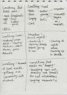


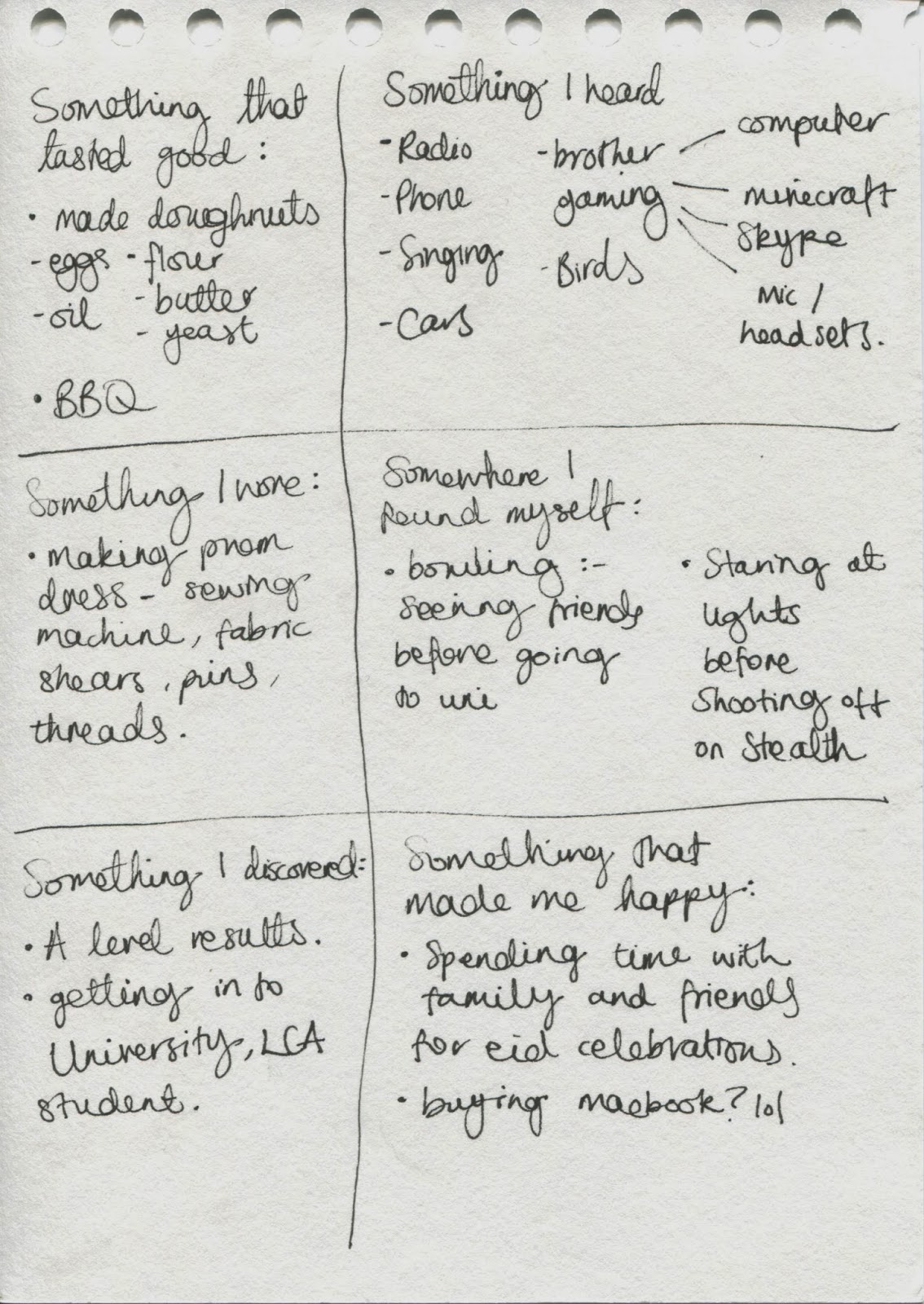


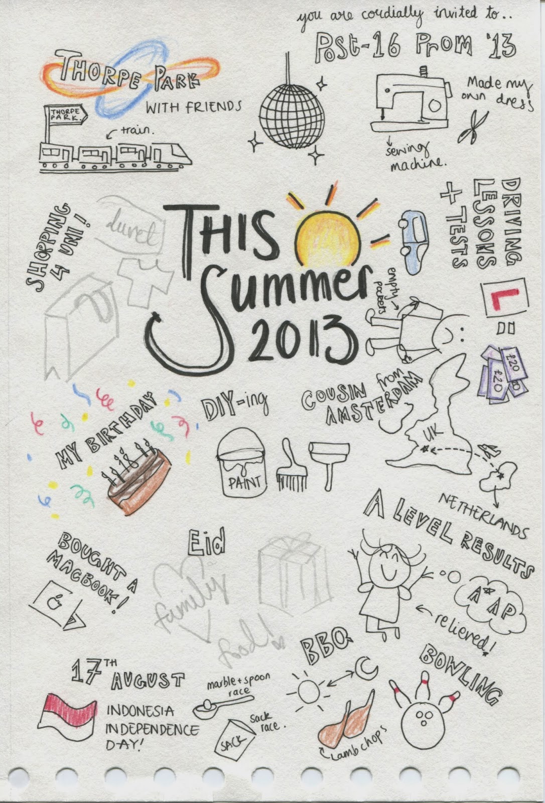


Unfortunately as the making process for each of these took quite a bit of time, I ended up only managing to produce 8 illustrations out of the required 10.
In the peer review session, my final illustrations were said to look 'professional', 'polished' and that it 'wouldn't look out of place in books/promo'. My peers also said that the use of framework and the 'bold' and 'stricking' colour is good as it 'creates a strong relationship' between each illustrations.


Induction Week T-Shirt Design

Subscribe to:
Posts (Atom)