26/01/2014

OUIL 405 End of Module Evaluation

As one of my interests is in illustrating children’s literature, I found this brief especially enjoyable. I enjoyed coming up with my own story and illustrating it as it feels more rewarding to me. I feel that what has been most successful in this module was the conceptual research at the beginning which has helped to form the concept of my book. Looking at and focusing into the theme of paranoia and schizophrenia not only helped to create, what I think is an engaging story for my book, but it has also opened my eyes more to what I could do because it isn’t something I would usually go for. Most of my research was collected through existing sources as I felt that it was the most time efficient way to get the information I needed, though maybe I could have done with one or two first hand researches as something different and possibly better could have come from it.

From undertaking this module, I have gained new skills and understanding in book binding and InDesign, which I now feel more confident in using. Through this brief I have also identified that my main weakness lies in the practical research and experimentation side of things. So as a result, there is a lack of investigation and idea generation through drawing and testing of other medias in my body of work. Going with initial designs when I should really develop them more is something that I really want to break the habit of and improve on as I feel that my work could be a lot better if I had really explored and experimented with it a little more.

Throughout this brief I have referred to different storytellers to help with the development of my story. I wanted my book to be aesthetically pleasing with an engaging story that was short but relatable to people. I really liked how Emily Hughes tells her story in her book ‘Wild’. Her use of simple short sentences supported by pictures make her story clearer, to the point and it doesn’t put people off from reading or turning the page, which was something I wanted to achieve. The detailed and loose lines and delicacy of her drawing is an irresistible feast for the eyes, something I also really admire which I tried to emulate digitally by making my lines a little thinner and working with confident movements of my hand.

In this module, I used Photoshop again to create my images. For me, I feel that this is the most time efficient way to make my drawings and this was important as I had over 20 pages to produce within a tight schedule. I also feel more confident with it as I can easily and quickly change elements of my work if I don’t feel happy with it. I started my image making process with a pencil drawing that I scanned in and used as a guide for my more refined work and used brushes from Domareen Fox for the textures.

I believe that I have managed my time effectively throughout this module and I feel that blogging my progress as I go is one of the reasons why I feel more organised; it helped me to reflect on things that happened within that moment which helped to identify what I needed to do next. I am overall pleased with the outcome of my book, but if I were to do this again I think I would give myself some time to develop and experiment more with the composition of my images and with other medias.

24/01/2014

Final feedback


Successes:
- I think the research has been successful - it has really helped me come up with a story for my book, although maybe I could have done with more first hand/primary research.
- Stylisation of characters/the artwork
- The story

Weaknesses:
- Lack in idea generation through drawing.
- I've not really developed the images - like before, I tend to go with initial ideas when I should really develop them more as something better could come out from doing it.
- I've not experimented enough with composition.
- I've not experimented with other medias

23/01/2014

OUIL 405 Final Outcome


I decided to saddle stitch my book in the end instead of making a hard cover for it, although I would have loved to if I had more time. I also decided to keep it full colour as people preferred this to the duotone ones. I was really wary about the type of paper I decided to print on because it was quite thick and I wasn't sure if it would be easy to fold and stitch, but I'm glad I picked it now because it gives the book a nice, sturdy, picture book quality. I am pleased with my book, but the only thing that really bugs me is how the printing turned out way darker than how the colours look on screen; (maybe because I converted it from RGB to CYMK? or maybe the type of paper?) which I think affected the colour quality of my book - some of the pages and the front and back cover don't look as enticing because it's made it really dark.
Some more imperfections:
Because the cover is so dark, scratches from printer, fingernails and ruler after trimming are really visible

I trimmed it crooked the first time so I had to take some more off to straighten it, and I accidentally chopped off a little bit of the speech bubble

Final Pages

17/01/2014

Composition rethink

In yesterday's progress surgery Fred identified some things in my work that I, myself did not even realise I was doing which has made me really reconsider the composition with some of the pages that I've not yet digitised. With the image below, Fred mentioned that the people behind her might not really be necessary, that it might not really serve a purpose - if the people are there to show that she is on the bus then they are not really needed for this piece to work because the text already says 'On the bus':


So with the pages below, I started asking myself if the people here are really necessary. Do they clarify my idea? Do they distract or confuse?


I decided to discard the people, and replace them instead with more speech bubbles to emphasise how the monster would make the girl feel vulnerable:


Fred also mentioned that even though they are different images, some of my pages interact and flow onto the next page which makes it work because it helps to control the eye's flow through its layout - makes it appear balanced and I guess, more visually appealing:


I took this into consideration and altered some of my pages slightly so that it flows and interacts with its neighbour - also to make it look more balanced as a double page spread:


16/01/2014

What kind of binding should I use?


Concertina:
- glue is involved
- sticky and time consuming with the gluing
- not really suitable for my book

Japanese binding:
- no glue is involved (which is good)
- a drill is involved
- uses single pieces of paper
- quite easy to do
- doesn't lay flat when opened
- you lose a centimetre for the binding

Saddle stitch:
- no glue is involved
- quick and easy to do
- quite durable

Perfect Binding:
- tiny bit of glue is involved
- quick and easy to do
- uses single pieces of paper
- not very durable - pages can easily come out
- so the thicker the paper, the better

I was also taught how to bind a hard back book because this is what I want, but I wasn't sure how I would get my front and back cover designs on it because you can't really print on the fabric. Sarah said I could make a dust jacket for it but then it would cover a bit of the pattern lining of the book and I would have to resize the front and back design so that it would fit perfectly when put on - so thats something more to consider and take into account. I decided to look for an easier (maybe?) alternative, again from Emily Hughes 'Wild':

not sure if I will have the time to do a mock up for this binding though.

Full colour or Duotone?

I feel like my colour choices are still a little messy and all over the place so converting my pages to greyscale, I feel makes it all come together - makes pages look like they belong together and flow better. But keeping it greyscale might look as though I've not really thought about colour and how it interacts with the pages. In the progress surgery, I asked Fred whether I should keep it as it is or do something about it and he suggested that I maybe play around with the monotone and duotone setting for a monochromatic colour effect - so it has colour but more subtle.


Maybe edit the cover as well?

I do like this effect, but now I'm just not sure whether people will think that this is just dull or boring because in the last peer review session, my peer said that she likes the colours because it brings the images to life. I will have to ask for some more opinions..

12/01/2014

My mutant power!

Task in response to 3D illustration:


I love to garden in the summer and watch things I plant grow so if I had a super power it would be the ability to make plants grow with a touch of my magic finger! please excuse the quality of the animation - my first time creating something like this but I really enjoyed it! I didn't expect it to come out this well, made me really happy hahaha..

This has helped me realise that illustration doesn't all have to be flat, hand drawn, painted, etc. they can also be lens based like this.

10/01/2014

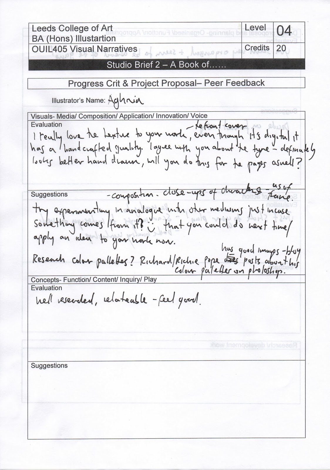
Peer feedback


Successes: 
- the artwork - colours and textures
- how I haven't used black outline
- concept - well researched 
- conveys an understanding of the feeling of it and its restriction and control
- organised

Weaknesses/what to do to improve:
- lack of experimentation with other media 
- develop technique within materials and experimentation more
- try experimenting in analogue with other mediums

09/01/2014

Front and back cover mock-ups


Can people tell that this is someone peeking through her fingers?

Front cover
Back cover
colour looks a little too dark - doesn't go with the brightness of the pages inside


Not quite liking the title typed up - it looks too structured and neat, not as engaging and active looking - there isn't that sense of panic. Written one also fits in with the look of the drawings.


08/01/2014

What kind of aesthetic do I want?

I really like the pencil sketch aesthetic of Emily Hughes illustrations so I tried my own digital sketch:

Original scanned in drawing

Playing around with saturation and vibrancy setting:
or greyscale?

Double page spreads:

decorative pages to go after front cover and before back cover
Could this be mistaken for butterflies instead of eyes?


Times New Roman to keep it simple and readable. Combination of written and typed up text to differentiate monster's voice from narrator's voice/main text:


Same background pattern throughout book to link pages together - also to make it less boring. Still not sure whether to keep pages in colour or greyscale. Both look good to me - greyscale one creates a darker, eerie sort of atmosphere but when I ask other people, they prefer the coloured version to the greyscale one.