27/02/2015

WWF: Initial Presentation Boards

Questions Sam and I came up with regarding our idea and presentation boards:
  • Do you think the idea is engaging enough?
  • Does it fit the target audience?
  • Which colours do you think would be best suited for the project?
  • Does it need anything else to show our idea?
  • Are the presentation boards too plain?
  • Any other suggestions?


Peer Feedback:
  • 2 minutes might be too long. Motion graph is very hard to keep someone engaged for 2 minutes with pure factual information. It might be better looking at the minute mark.
  • Boards are nicely and professionally laid out, but there isn't much to show about your actual idea - storyboards etc.
  • It definitely reaches the target audience
  • Single line to signify interconnectivity is an effective solution, but is it too simple for 2 mins?
  • Could have more colours and textures in area but always return to the line.
  • Like the info graphic idea, 2 minutes might be a bit ambitious but will work nicely. Liking the colour schemes. Could relate to the audience by using technology in animation.
  • Initial idea has potential, but fluidity might require a bit too much time for a 2 min piece.
  • Love the idea - the idea of the world unravelling into the human figure.
  • Cool idea!
  • I like the simplicity! works well.
  • The text on presentation board could be reduced to make room for more concepts/images.
  • What information is going to be presented in your animation?
  • Any concept work or idea? - isn't really clear on what it will really be like.
  • Colours:
    • 3rd colour chart, 2nd brown texture.
    • Blues, greens, brown shades - Earth brown colours in the background
    • I think you should use greens and browns but you might need blue is you're doing a globe.
    • I like the 3rd column of colours and 2nd background.
  • Boards are good - bright colours and graphicy pictures could work for the audience.


What we took from this:
  • 2 mins might be too long - make it 1 min instead
  • Need some concept art/storyboards to enable others to understand and visualise idea better.
  • Colours: Green, brown, blue.
  • Mistake on 'Why' column (which I've amended before uploading)

26/02/2015

Tigerprint: Floral Pattern Shortlist

out of 1400 designs I made it to top 87, well happy! means I am just as able as surface pattern designers and can make patterns too!

25/02/2015

Alice: Adjustments

I realised the logo that they provided me with was at a resolution that was much bigger than 300dpi, which was why I found it a little odd when I placed it into my illustration to find it filling up the whole of the image. I lowered it down to 300 to match my illustration resolution and decided to keep the size of the logo as it is to be on the safe side (incase Macmillan requires it to be this size) which meant I had to make a few adjustments to the placing of the logo - which also meant I had to replace the empty space with the rose that was there before:

Final Presentation Boards for submission:

23/02/2015

Live Brief - ayasoBoutique

I've been asked to do some re-branding for a business/boutique aimed at those with a passion for modest fashion and unique finds for the home. I have been asked to create a new visual concept that they could apply to promotional materials, products and website to update and improve their overall business image and to attract and appeal more to customers. As part of their new collection, they want me to work with Peach, Light Grey and White colour scheme and a few other things that they already had in mind. They want an element/logo that reflects their signature sense of Modest Femininity and they have given me the entire control over what I come up with for this.

Using Spot Colours in Photoshop

Channels > New Spot Channel
Can overlap colour like 'multiply mode' - if want it to be solid colour put in 100% in solidify option when choosing colours.
Can get tints of colour when you change the brush colour to gray.
Save as .psd or .tiff (make sure spot colours is ticked)

Document ink all about halftones - can print positives for screen printing.
Freq 50-65 lpi - as good as you can get with screen printing (finest)
Angle (if ink contains tints) - 15, 75, 105, 155 (for full CYMK)

22/02/2015

Tigerprint: Patterns

Below are my floral patterns inspired by SS2016 colour palettes! (at submission size - 500px x 700px at 72 dpi). To me spring/summer is all about fun so I wanted my patterns to have a really happy, playful feel to them! I think the looseness and the geometric shapes add more of an interest and playfulness to the work! also some of the flowers are imaginary, because whats the fun in doing real ones, right?


SUBMITTED!
I really enjoyed doing doing this brief, and I really hope I win and get the possible placement! that'd be super great!

Tigerprint: SS2016 Colour Palettes

When thinking about spring and summer the colours that come to mind for me would be fresh, bright and warm colours. I found this website and they have a section for SpringSummer2016 trend forecasting - A TREND/COLOR Guide that offers seasonal inspiration & key color direction for Women/Men's Fashon, Sport & Intimate Apparel. The colours that really speak spring and summer to me are the ones below (all taken from previously stated website):


As we are allowed to enter 5 designs per entry, I think I will create a pattern based on each of the colour palettes above.

21/02/2015

Alice: Interior Page

Initially I was going to create two interior pages for this brief, however, after creating the book cover illustration I realised that creating paper illustrations is very time consuming. Because of this I've decided to do just the one interior page.


FINALLY DONE!

17/02/2015

Alice: Cover

Initially the logo was going to go top right corner, however I didn't think it worked there so I tried placing it elsewhere. The brief did not specify exactly how big the logo needs to be so I decided to make it quite small, but still readable, so to not over power everything else.

I decided hand drawn type would be best suited for the cover because everything else is handmade. I used the drop shadow effect to mimic the look of cut paper so that it would suit the whole illustration better:

16/02/2015

Software Session 2 - Colours for print (Ai)

Spot colour - colour thats applied using its own ink
Why?

  • can be significantly cheaper - fewer ink the cheaper the printing would be
  • consistency and accuracy
  • can get colours that you cant get with cymk inks

Pantone - only for commercial print.
-Pantone reference/colour book - unique code number of a colour - would give you that exact colour you want

Type of paper

  • coated - glossy
  • uncoated - matt
Tints - colour variation, but working with just one ink.

15/02/2015

Alice: Production Progress

The final will be enhanced a little bit on photoshop. I decided to try it out with the photo I took on my phone:

13/02/2015

Responsive

Yesterday we met up and agreed and signed our contract:

I discussed with Sam my initial idea, but we decided that before we focus on how the animation is going to move, it is important that we select and pick out important information from the Living Report first. When me and Sam went through the report, we both found it quite difficult to read and stay focused as there is a lot of information. However from doing this, we found out that there is a need for this animation so that people can have another way of getting this information in a more friendly, understandable way.

As I had something else planned in the afternoon, we decided that our next task was to, again pick out information from the report and for us both come up with some sort of rough plan/storyboard individually to explain our ideas. We will see what we both come up with and hopefully settle with a middle ground.

Studio Brief 1: Project Proposal

Project Rational
What are you going to do? (Product, Range & Distribution)
I am going to produce my own illustrated product range - Paper goods and Gifts.
  • Art Prints
  • Art books - collection of my illustrations
  • Greeting Cards / Postcards
  • Wrapping paper
  • Tote Bags
  • Apparel
  • Notebooks
  • Homeware products

What do you want to achieve?
I want to expand my work into textile design, product design and packaging. I also want to achieve something that reflects my interests and would be commercially viable.

What do you want to learn from doing it?
  • How to market my own product range
  • What audience will be suitable
  • Where the work will exist (context)

Themes/Subjects
General Themes:
  • Dance
  • Music
  • Performance

Specific Subjects:
  • Movement
  • Figures
  • I am fascinated by movement and I love to draw figures so I am going to combine them and explore it further by drawing figures in motion. I want to capture the energy and the feeling/atmosphere that different dance styles emits.

Practical & Conceptual Application
Specific Disciplinary Area:
  • Product Design
  • Illustration
  • Character Design
  • Textile Design

Audience/Contexts:
  • Lovers of Illustrated goods
  • Could be sold at places like Paperchase, Hallmark, etc.

Production/Distribution methods:
  • Products could be distributed through a wholesaler, retailer or sold directly over the internet.

Contextual References
Illustrators/Designers/Studios:

Creative Skills - Practical skills I intend to further develop and apply during my project.
  • Use of pattern
  • Use of colour to reflect feeling/atmosphere
  • Printing onto fabric / applying my illustrations to other materials
  • Making more complex repeat patterns

12/02/2015

Visual Journal: Starting Point


I want this module to be something really enjoyable and reflect my interests, so when starting my visual journal research I had to really think about what I really love and enjoy drawing. I am absolutely fascinated by movement and I love to draw figures - I envy those who can dance so so well - so I thought why not combine them together and explore it further by drawing dancing figures! I want to capture the motion, the energy and the atmosphere that the dance emits.

09/02/2015

Idea 1.

I emailed Sam earlier to ask what she thought if we did an animated infographic, like discussed in my previous blog post. She agreed with me about approaching the brief with a simple mindset/concept, but one that would be really effective in communicating our message. She agreed that the infographics will really help convey what we're talking about. 

After confirming that we should go ahead with this, I decided to look back at all the things that both me and Sam liked in the animations that we both collected and commented upon as research. We both liked the illustration style in the animation stills below - how its just outlines as it is clear, easily understood, nice and simple. I also remembered Sam talking about the 'Where Good Ideas Come From' video (also below), and how she liked how at the end little bits of the drawings turn into an overall bigger image.


Pulling all these visuals together, I came up with an idea where the animation/inforgraphic would all be done in one continuous line. This would illustrate that that our relationship with the planet is reciprocal and that we are all connected to each other in one way or another. After all the necessary information and statistics are explained, in a similar way to the 'Ideas' video, the video would zoom out to reveal a massive thing (probably our planet, Earth) to show our connectivity to one another. To illustrate how being careless and ignorant could affect our planet, I thought about having something (maybe our actions that are affecting our planet) cut through a line, which would shatter the whole image - showing how one thing that affects a particular thing would also eventually affect everything else.

Sam and I have planned to meet up and discuss this brief further on Thursday. I will use this time to explain my idea to her and get our heads together and to hopefully start roughly visualising bits and bobs! It will hopefully be a productive day!

Animated Infographics

I think the most simple but effective way to communicate what is happening to our planet would be through an animated infographic. We have been provided with the stats and information to be able to do so and I think with the limited time that we have and busy schedules, I personally think it is best if we keep it simple and to the point. I need to discuss this with my partner before anything else major is carried out, but I decided to look into some examples anyway and I think the ones below, communicate their messages effectively, in a simple but eye catching way:


Software Session 1 - Colours for print

RGB - red green blue light - screen based colours - photoshop default mode
CMYK - cyan magenta yellow black - process colours - printing inks used in the printing process

View > Gamut Warning: shows areas where colours are non printable (not in the CMYK range)
Select > Colour range: to select a particular colour to adjust
To select all of the out of gamut area: Select > Colour Range > drop down and select out of gamut.

Adjustment layers (at the bottom of the layers palette) and layer masks - would allow you to go back and adjust again and again, and can also turn it on and off without making permanent changes to your work.

Image > Replace Colour: would allow you to select a particular colour and would give you same adjustment settings and change colour.

  • Photoshop advises that you work in RGB mode first until you are done with the work. Then convert to CYMK if you are going to print the work. There would be a slight change in colour but you can make adjustments to it until you are satisfied with the work, before sending it off to the printers.

Stuff to remember:
  • Work at 300 ppi (or dpi)
  • CMYK for print
  • Work to actual size
  • save as .jpeg when sending to client though email
Select gamut (triangle warning sign) for cmyk colour

08/02/2015

Study Task 1 - Research

5 contemporary artists/Illustrators whose practice inspires me and whose practice is clearly linked to my chosen area of study for research:


J2O

What problem(s) are identified by the brief? 
-The current artwork design is not seen as ‘adult’ by many; the colours are viewed as bright and childish, and some consumers have even described it as cheap and ‘chavvy’.

What is the brief asking you to do?
-Redesign J2O to appeal to a target audience of 25-35-year-old men and women.
-Share up to eight images in total showing your solution for individual bottles and four pack, along with supporting information that briefly articulates your idea in words (up to 400 characters)

What is the brief trying to achieve?
-The design should make 25-35 year old men and women proud to be seen holding J2O in bars, restaurants and at home, and should bring through J2O’s expressive, unpretentious and playful personality

Who is the audience?
-25-35-year-old men and women

How will the message be delivered?
-Product packaging/design

Why I chose this brief:
-Not done packaging design before, so I want the experience.

To get me started, I decided to look into the packaging design of other bottled drinks served in bars and restaurants. Most of these are of course alcoholic drinks, and what I found in common across most of these drinks was that they use very little colours - sometimes quite dark, earthy and muted - most sport the same colours (green, yellow, black and red). I also found that typography plays a big part in it. I used my Pinterest to collect images of bottle designs that I think reflects a mature but still quite cool personality which I think would look quite attractive to the 25-35 year old market.

Applied Illustration

When we were briefed about this module, we were asked to think about our interest and the kind of work we want to be doing. For the next session we were asked to bring in a body of research into one of the following areas:

  • Publishing & Book Design
  • Editorial & Reportage
  • Character & Narrative
  • Product & Packaging
  • Children's book & Education
  • Object & Environment

I've always had my mind set out to work within the animation industry as an illustrator, doing character design and visual development so it would only make sense that I pick Character and Narrative out of the others. However, I am also really interested in applying my illustrations to products and packaging and I also want to try something different while I have the resources and opportunity to do that, so I decided to pick this category. Fred also said that the categories could cross over to one another which means I'd still be able to do character designs if thats what I want.

My Product and Packaging pinboard on Pinterest showcases examples of work that I am quite interested in producing for this module. At this moment I am really leaning in towards products that intersect with textile design - this might be because I have a textiles background and my mind is just itching to touch fabric again.

Pushkin Press

Brief: The Allure of Chanel by Paul Morand

What problem(s) are identified by the brief? 
-Already published as an illustrated edition with illustrations by Karl Lagerfeld, Pushkin Press are looking for a completely new look for the forthcoming (non-illustrated) Collection edition of this book

What is the brief asking you to do about it/them?
-Give them my own illustrative interpretation.
-To submit a stand-alone image that we will be able to reproduce in their Collection cover layout.

What is the brief trying to achieve?
-New front cover illustration
-Inspire readers to immerse themselves in main character's (Coco Chanel) extraordinary world.

Who is the audience?
-Not specified in brief but because of who the book is about, I would imagine elegant, modern, and classy women between the age 18 – 39

Why I chose this brief:
-Want to try doing a book cover design thats not targeted at children - the visual quality of existing Pushkin Press book covers in their collection are quite different to my usual work, and I want to try something different.
-Also because Pushkin Press book covers are greatly admired as a platform for some of the world’s leading illustrators and image makers such as Jean Jullien and Ping Zhu.


Initial idea:
From looking at the other existing covers in their collection, they are rather clean and simple looking so my first response was to illustrate Coco herself looking elegant and classy and rather alluring, or maybe parts of her that are quite iconic (e.g. her dress sense and cigarette in hand). I saw the illustrations below which I think might be digital but they used a watercolour wash texture, and thought I could maybe do it in this style. I also like how they have very simple compositions, which I think visually would work well alongside Pushkin Press' existing book covers.

I decided to collect photos of Coco for future reference:

Tigerprint

Brief: Tigerprint Floral Surface Pattern

What is the brief asking you to do?
-Design a pattern for a female recipient that could be used across a range of our wrap products including gift bags, wrapping paper and tags

Who is the audience?
-Keep the Marks and Spencer customer in mind.
-Design must have a commercial feel that will appeal to women.

Why I chose this brief:
-I have a textiles background and would like to try making repeat patterns.

The brief wants you to look at spring/summer 2016 trends for inspiration. I decided to collect some images through Pinterest. When collecting these images I mostly thought about the colour palette that I think would reflect this season. I also had the Marks and Spencer customer in mind when collecting images for inspiration - from looking at the Marks and Spencer website you could tell that the majority of its customers would probably be working professionals, quite savvy, so I tried looking for colour palettes that are quite elegant yet still fun and lively to reflect the spring/summer vibe.

05/02/2015

Contextual Research

Existing WWF (and similar) Campaigns:

WWF campaign from Desrumaux Celine on Vimeo. - Textures and a bit of 'noise' make it appear hand made/crafted - less cold looking. I like the use of colour, grayscale and a bit of colour. I think its very effective to show the 'domino effect' and the positive change - how one act of event can set off a chain of similar events, in this case how your help for the environment can set off other people to do the same.


WWF Cursor Swarm from Moth on Vimeo. - Concept is very similar to the one above. I like the little estimate at the beginning to give audience a picture of what will happen unless things change. Really digging the visual quality of this one, the simple outlines and the limited colours used. Hand drawn quality makes it look less cold and mechanical - natural/eco friendly looking - appropriate for the content of the video.

Planet Under Pressure from Moth on Vimeo. - Aesthetically pleasing, beautiful visuals, bold shapes and colours, voiceover/narration - informative makes it easier for the audience to understand whats going on. Attractive to both young and older audiences.

101813 WWF FISHING REV 004 1080p h264 from againstallodds on Vimeo. - Looking at fishing from a different angle - the humour/exaggeration is great to show how irrational we can really be when it comes to treating our planet. Happy background music makes it seem like its a normal and ok thing when its not - shock effect - makes the audience want to do something about it.

WWF - 40" TV Commercial from Samuel Abrahams on Vimeo. - Although not an animation, I like the contrast/compare splitscreen format of this video. Shows how similar and connected we are to these animals, that our relationship with the planet is reciprocal - what affects them will affect us too.

Collaboration Brief Selection

We were asked to select 3 briefs to bring to today's responsive session. When I got together with my partner, we decided to take on D&AD's WWF brief because it was the one we both picked.

What problem(s) are identified by the brief? (from WWF's 'The Living Planet Report 2004)
-Wildlife populations worldwide have declined by 52 per cent since 1970
-We are living as though we have more than one planet at our disposal
-By taking more than nature can replenish, we are jeopardising our own future

What is the brief asking you to do about it/them?
-To take the Living Planet Report findings and make them relevant and accessible to the 'always on' generation.
-Find a way to communicate that our relationship with the planet is reciprocal: we need the planet and the planet needs us.

What is the brief trying to achieve?
-Inspire a new generation to understand that we all have an impact on our planet and an effect on its health.

Who will benefit?
-WWF
-Us/our planet

Who is the audience?
-14 to 24 year olds, who have the opportunity to shape their futures

How will the message be delivered?
-Through moving image/animation
-Online so accessible to the 'always on' generation.

Can you foresee any problems in responding to the brief?
-Not having enough time to do it

Why I chose this brief:
-Because animals
-but on a serious note, I am also interested in doing something to better/save our planet
-Also because I think the brief would allow us to really put both mine and Sam's practices/skills to use.

03/02/2015

Collaborative Practice

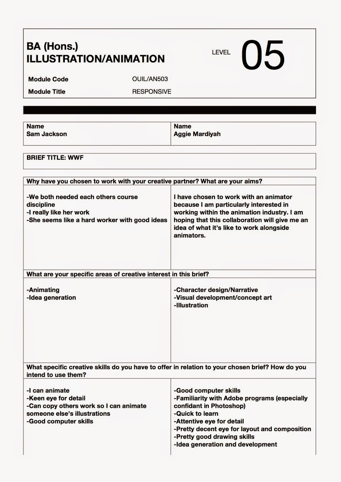
When we were briefed about this collaborative practice two weeks ago, I really did not mind who to collaborate with, but as I thought more about it I decided that I wanted to collaborate with an animation student because of my interest in working within the animation industry. I think it would be pretty interesting bringing two different minds and practices together and I'm quite excited to see what we both can achieve. 

I emailed some of the animation students on Fred's list of people (which he emailed to us) who did not yet have creative partners - now I have an animator to collaborate with! - awesome!

We were also asked to fill out the pro forma below: