25/02/2014

Postcards

I decided to do a little research into existing postcards, just to see what's already out there:

Follow Aghnia Mardiyah's board Postcards on Pinterest.

Most of them are all quite similar in that they all include and focus on the iconic/recognised landmarks and architecture associated to that particular city. There aren't many postcards that actually portray the people - maybe this is something I could do? Most of them have also used limited colour palettes which works really well. The aim of this brief is to communicate purely through image and not use type as a means of communication which some of these postcards have not done as some of them have incorporated the names of the cities to the design.

Illustrator Workshop 1

Pen tool exercise - getting used to the pen tool:

I've never had any experience with Illustrator before, so this was my very first go on it. I did find it at first confusing and difficult to understand how to use the pen tool as it looked really complicated when James was showing it to us on the screen - it felt like there were lots of things that I needed to remember, like the anchor and handle and what they do - but once we actually got to do it ourselves with the help of this exercise, I think I have now a better understanding of how the pen tool works. Still not totally confident with it but with more practise, I'm sure I'll get there

24/02/2014

Greetings from..

"produce a set of 4 postcards based on 4 major world cities of your choosing. Your illustrations should aim to effectively communicate the individual identity of each city but at the same time work as a set, series or sequence"
Notes:
  • Final resolutions need to be digital
    • use skills developed in the Adobe Illustrator software workshops
  • Consider iconic buildings/traditions that represent the cities of my choosing
    • also skylines, buildings, objects and people associated with my cities
  • Demonstrate an understanding of frame, format, composition, colour, line, shape
  • REMEMBER TO EXPERIMENT! - thumbnails, scamps, colour tests
  • I think keeping it, the idea and concept simple would be best for this brief because
    • I want to spend more time on visual research - the experimentation/play bit
    • not familiar with Adobe Illustrator yet - so not sure how much time I need/easy it would be to make one postcard with lots of details

I am quite excited about this new brief! It will involve me doing quite an extensive breadth of visual research, development and experimentation which was identified in the book module that this was the area that I produced the least work in. Hopefully, from doing this brief I will be able to improve my skill within this area and to finally apply the knowledge I've gained about composition and thumbnailing from the recent visual language class to this brief successfully.


Below are just some of the cities that I'm quite interested in illustrating - I have thought about Paris and other popular holiday destinations, but I thought maybe a lot of people would do them and I kinda want to be a little different:


..really need to narrow down my choices

23/02/2014

That's Pants! Final Resolutions

'A single photographic image printed in A2'

'A 10-30 frame animated gif representing your response'
Group Evaluation:
  • Everyone contributed well in 
    • the research
    • idea generation
    • the making of the final resolutions
  • Communication was good - there was always someone from the group (in the studio) even when we didn't plan to meet up which was really handy as it made it easier to get opinions/suggestions and help on things that we were working on which just made everything more time efficient.
  • Each of us had different skills to offer - digital skills, idea generation skills, photography skills, researching skill, etc. - we all brought something different to the group
  • There were lots of quality control going on - always discussing the work, passing and adjusting things between us to better our work
  • We all think that the image was well chosen for A2 poster - something that is different and not included in the gif, makes it more interesting and less boring - and it compliments the gif well
  • Working in a group makes decision making and problem solving run a lot smoother and easier cause more than 1 brain
  • There wasn't really any conflict between us and I think we were really agreeable, which again made everything just a lot better and more productive - We all appreciated the ideas each of us brought to the table, and everything that was done was achieved by the contribution of everyone in the group.
  • Overall, I think we just worked really well as a group - really happy with my group members, they are good, cooperative, dedicated people :-)

20/02/2014

Etching workshop

my copper plate with flipped drawing scratched into it:
The printed etching:
It took me quite a bit of time to actually get to the printing stage - I first had to sand and varnish the metal plate. I also had to flip my drawing so that the writing would be the right way when printed. I made my own version of the carbon paper - as the college didn't have any - which I used to trace my image onto the metal, that I then went over with the scratching metal tool. 
To summarise:
  • it was really interesting to step away from PS and to actually try a new media that doesn't involve the computer screen
  • etching is a pretty time consuming process
  • though metal plate looks cooler than actual print

19/02/2014

Making our gif

Yesterday, Jessie and I started to select some of the photos (from the 100+) that we took that we felt worked best. We also started making/laying it all out on Photoshop for the gif. I then asked Emanuel if he could fine tune it and just make adjustments to whatever he felt needed to be changed. This is what Emanuel and Kane came up with:

Here, the timing has been adjusted so that pauses are made after each event - this is to balance out the timing and to keep a nice and steady, constant rhythm throughout the gif because we found out that it didn't really look right with only the first and last frames of the gif showing longer than the rest. Also, the pissing scene is removed from the previous version that Jessie and I started with as Kane and Emanuel decided that it didn't really work, which was true and I totally agree with them.

I then made some further adjustments to the gif above:

18/02/2014

Editing Pictures

As a group, we went out and took some photographs for our gif and final photograph on Friday after the Skype lecture with Ralph Steadman. This was the really fun part and I really enjoyed it (Photographs here). 

Editing in our posters/flyer:
adjusting the saturation and brightness:
experimenting with the lens blur:


12/02/2014

Gif ideas

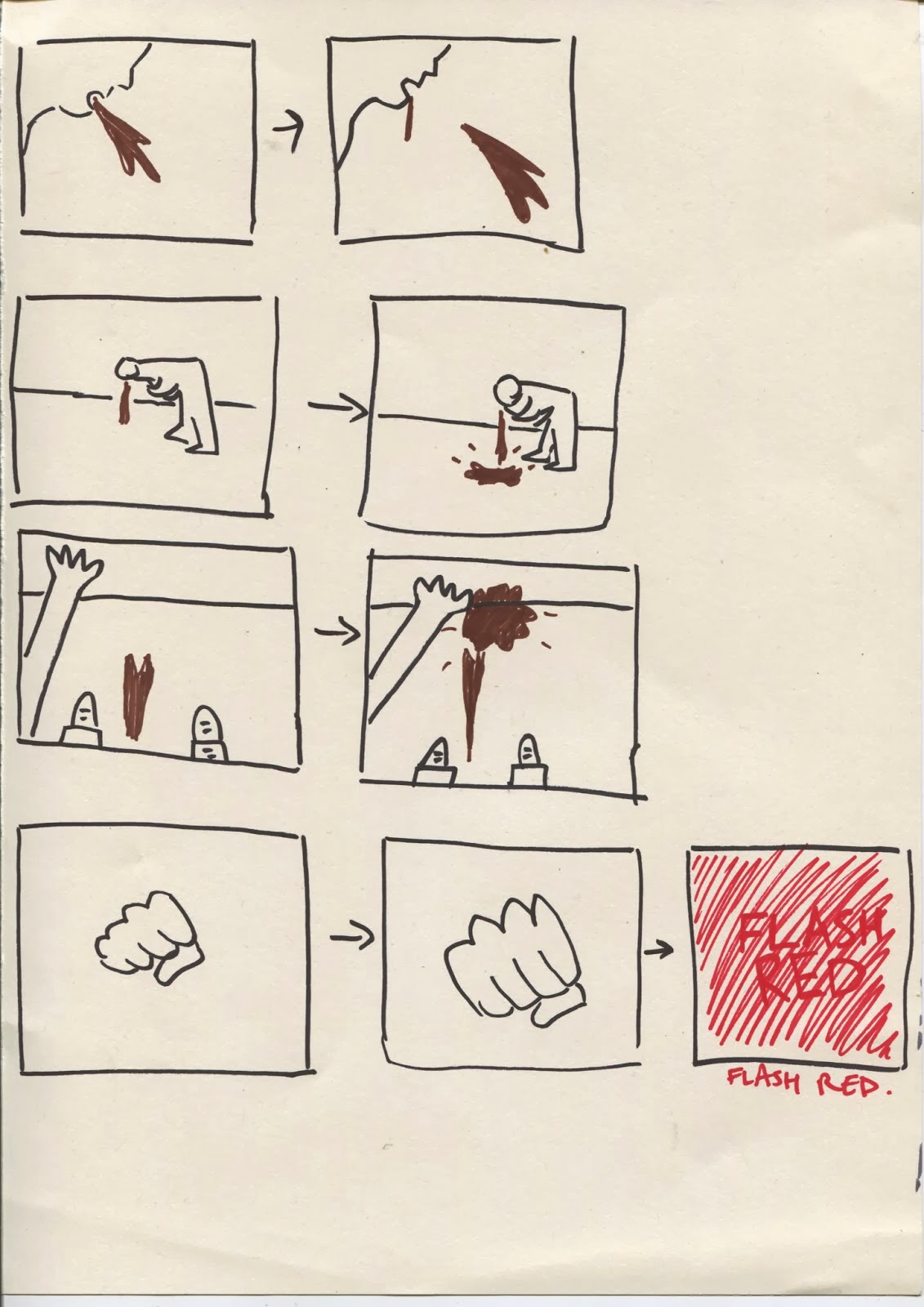
These are some of our gif ideas (I think there were others that we just discussed verbally). As a group, we agreed that the fourth idea is more rounded and has the most potential:

Inspired by this punching gif on gifparanoia, we plan to limit the frames (maybe 1-5 frames) for each thing that happens before our guy passes out. We also decided that we would use paper cut outs for things like blood, vomit, and pee etc.:

Some potential first person and second person thumbnails by Emanuel:


After discussing it as a group, we agreed that the first person viewpoint might just be better than the other - keeping it first person and keeping the person's appearance anonymous puts the audience in their place and implies that it can happen to anyone and not just specific types of people.

Trying things out with the text - some movement makes it more engaging:

Viewpoint & Depth

Yesterday's task was to devise, plan and develop a piece of artwork that features three figures. Compositionally the figures should have a sense of depth and/or a consideration of viewpoint. I decided to move away from my earlier visual subject of zookeepers as I wanted to do something different. My thumbnails - some I drew from my own imagination and for the others, I used a variety of image references from google to inform about the posture and proportion:


reference
My more refined resolution - I tried to focus on line quality and mark making for next weeks dry point/etching workshop

I am pleased with the outcome, however I still think that I could have experimented more with it - telling the same story in a couple of different viewpoints instead of just looking straight on might make the drawing look more interesting - I won't know until I draw and explore it again from different perspectives.

11/02/2014

Flyer mock up

On Monday we agreed that we would each make a mock up(s) of the flyer/poster.
I used these two for inspiration (right one from internet - something more artsy and visually appealing) - I chose to base my flyers on the left one as it's as though encouraging people to get drunk and behave in a way that they would otherwise not do (and become this 'club knobhead'), and that is the point we kind of want to get across - as well as that the prices some nightclubs offer are extremely low which makes it even easier for people to turn themselves into knobheads:

A couple of short and snappy, drunk, alcohol-related phrases inspired by the flyer on the left (had to make use of the Urban Dictionary to get some of these hahahaha):

I decided not to include any sort of characters/stereotypes so to avoid offending people:
Keeping it simple and clear to avoid hampering the message (polygonal and gradient tool for background - supposed to look like nightclub lighting/laser lights - so to set the nightclubish, partying, getting wasted sort of atmosphere)

07/02/2014

Preparation for Monday

Today we all got together to review the decisions we've made and to sum up what we've got so far with 5 posters underlining what we think is pants, why we think its pants - with proof, our aims and strategy. Here are just a couple of images of us working:


Crit feedback on monday:

06/02/2014

Why is it pants?

Because alcohol is a huge part of clubs/bars etc, I decided to start researching into alcohol consumption and expenditure in Leeds which then led me into finding more things out about other things alcohol-related - including alcohol related crimes, people's behaviours under the influence of alcohol, student life in Leeds etc:
first half of research found here


Leeds is home to a large number of bars and clubs, all of which have a different event meaning there is a place for students every night of the week. Each place gives a cheaper price for students, giving them an easy opportunity to consume a lot of alcohol:


Another source that is readily available for alcohol for the people of Leeds is supermarkets; Even with the rising cost on alcohol, supermarkets readily put cheap offers on to get customers in to pay for a lot of drinks. For example:

£8 for 12 x 440ml cans, meaning only 66p a can (cheaper than a bottle of water)

£14 for 24 x 300ml, meaning only 58p per bottle

05/02/2014

That's Pants!

"You are not entitled to your own opinion. You are entitled to your informed opinion. No one is entitled to be ignorant" - Harlan Ellison
Points to remember:
  • Devise, propose and deliver a visual intervention/happening or activity that highlights some aspect of modern life that - as a group - we feel warrants attention.
  • A satirical approach to modern day living and use our abilities to visually communicate our opinions in order to PROMOTE, PREVENT or COMMENT on something that is pants!
  • A single photographic image printed in A2 format
  • A 10-30 frame animated gif representing our response
  • Nothing illegal, offensive, or unsafe

WHAT IS PANTS? (group work) - list of some potential subjects that we as a group think are pants:
  1. Chain mails
  2. YouTube comments
  3. No Wifi
  4. Train fares not fair
  5. Excessive plastic packaging
  6. When you eat biscuits and they all disappear because you've eaten it
  7. Blaming gay people for flood (politician David Silvester) 
  8. Club knobheads
  9. Useless social media trends (e.g Nek nominations)
  10. Addictive games
  11. How celebrities who are basically role models, who think they can do whatever they want not thinking about how it would affect fans (e.g Justin Bieber)
We then narrowed it down to gives us the top 3 - I wasn't sure with some of these but as we are working collaboratively, the group's opinion is also important:

A different group then chose one out of these three subjects that they felt was most pants for us to start working with; which was 'club knobheads'. I was a little bit wary at first about having this particular subject to work with as I have little insight into clubs, pubs and bars and the types of people that can be found in these places because I personally don't go to these places. But of course I have my trusty group (Jessie, Emanuel and Kane) and the internet to find more information about this. Hurrah!

04/02/2014

Composition continued

Today, we did something similar to the previous task - we got given 3 elements to work with: a figure, an elephant and a butterfly. We had to try make our compositions as dynamic as possible, taking into account the picture area, the varying sizes of elements and overlapping. My thumbnail sketches:


My more refined drawing:
I am overall happy with this drawing - the format and the placement of elements. However, I don't think that I have been very ambitious with the dynamism of this piece because I feel that the elements are all still relative in size which doesn't give the piece that much depth. This lesson, I have learnt that there is more to consider than just what goes into the piece but how they are arranged to tell the story/to clarify the idea, within a frame.