10/12/2015

Inspiration: Joey Chou

I am a big fan of Chou and his use of shape and colour! I really like his illustrated “Thanksgiving activity book”! The whole book is filled with fun facts about the holiday and all sort of activity you can do with kids. It's also got lots of stickers, puzzles, maze, paper cut out turkey to make a thanksgiving centerpiece for your kids table.

This is the kind of thing I want to create for my Hospital activity book but instead of fun facts about thanksgiving, I was thinking maybe about the human body instead? because the human body is amazing! maybe about transplants too, with games and tips to keep yourself healthy etc. So it'll be quite educational but fun! - this way it can also be used outside of the Hospital, maybe in schools and even at home.

Winter Break Checkpoint

Made a checklist so I can see who I've done and not done! As well as finishing all of CoP, my plan is to try complete all the sketches for everyone during christmas break and make the paper illustrations when I come back in January! 24 more people do to! I CAN DO IT!

29/11/2015

Silhouette Animation

I've been thinking about the kind of animation that I can do for this brief. I really like Malika Favre's shadow imagery here and my brain's been trying to think of ways I can incorporate this with our idea. Then I came across Lotte Reiniger's silhouette animations and thought they were so lovely! In my mind, I imagine the shadows/reflections in our posters coming to life so keeping things to simple shapes would really help a lot with the animation (since I'm not pro.. yet).


The animation below is has more contemporary feel to it and it's based on Lotte herself. I really love it! the music and the dancing figures! maybe we can even interpret extracts from operas and make a series of Opera Shorts! Ahhhh my brain is running wild! I think I should focus on one first though! I am sooooo excited and soooo up for the challenge of creating something like this! (it wouldn't be this long though and simplified)

27/11/2015

Mountain Climbing

Hang Gliding

Resolved Idea!

Becca and I had a little meeting about our YCN brief today and we have come to an agreement!
We have decided that an interactive poster is the way forward. We both agreed that this will open up more roles for us. Our idea is quite similar to the Nokia one below:


When you place the phone over an animal’s mouth on Nokia's interactive posters, this area will come to life on the phone’s screen.

For our idea, we will instead have a QR code that people can scan with their phones/mobile devices which will enable them to view an animated version of the poster (we will keep the animation quite simple). We want to have something along the lines of "Scan to unveil the magic" or something like that to get them more interested.

Our poster idea is still the same - using the mirror/reflection imagery. Both of us will come up with the sketches/thumbnails, but Becca will mostly be in charge of the posters, while I will be in charge of the animation.

Also thinking to have a tagline for the poster but we've only got one so far (which Becca came up with) which is "Reflect your inner opera" or "Unleash your inner opera" sounds good as well.

Underwater Adventure

I've decided that I'm going to illustrate 3 Adventure activities - Scuba Diving, Mountain Climbing and Hang gliding (Water, Earth, Air). I'm going to make 1 main illustration for each one, these will screen printed and then taking the motifs from each to create patterns or something similar to put on other products such as mugs, tea towels, etc. I'm going to start with Scuba Diving! I've collected some reference images to help inspire me!

Inspiration: Malika Favre

I found another illustrator who used the idea that is quite similar to mine - Malika Favre kinda used the same mirror/reflection imagery in her work for the BAFTA (below) - which look oddly similar to what I did for the Coraline brief I produced last year! weirdddd..

I like the simplicity of her illustrations - the simple, quite straightforward compositions and limited colours make it easier for the eye to focus on the characters - also make them so much more sophisticated and therefore more suitable for the the BAFTA and also for the target audience. I think this is something that we should also take into consideration with our own posters since we want to be attracting similar markets.

I just did a further research of this and just found out that the BAFTA ceremony was actually held at the Royal Opera House in London! hahaha closer to home than I originally thought.

26/11/2015

Being more ambitious!

Been thinking about this year's YCN winners' work because they were sooooo amazing, I thought just making posters might not be enough! I AM IN IT TO WIN IT! and so we have to dig a little deeper and be a little more ambitious! and since I'm collaborating with someone else, being more ambitious will be a little bit easier/more achievable because 2 brains and 2 pairs of hands! So while I work on one thing, Becca can do another thing! (but we'll both be involved in each thing in some way)

Anyway, lets get to the point!
I am currently thinking about how I could make the poster idea into something that could be interactive. People don't really respond to normal posters, they just look at it and then walk away - but if we made it interactive, people are more likely to pay it more attention.

I came across the video below and thought it would be a good idea to get mobile devices involved since the target audience (everyone actually to be honest) is always online/on their phones nowadays!


I also like this McDonalds puzzle poster! doesn't involve a phone or anything of the sort, and doesn't portray the McDonalds product on it, but I think it's still such a strong piece of advertising work - works so well with the tagline and its also fun! if I saw something like this I would go tell everyone about it - again, a very effective advertising campaign!


I'm going to bring up the interactive idea to Becca in our meeting tomorrow and see what she thinks - I think its a good idea as this would open up more opportunities to put both our skills/abilities to use!

Inspiration: Filiskun

I feel like I'm still pretty lost with the art direction for this brief so I decided to look at some existing t-shirt designs on Qwertee for some inspiration! 

I found Filiskun and I really like his designs! I like the idea of using shapes and silhouettes and limited colour palettes - I think this would make it easier to screen print. I also really like that he makes the t-shirt colour as part of his design - makes it look like it wasn't just slapped on a t-shirt but actually thought about!


Illus x Photo: Des Taylor

I've been trying to look for some people/work that combines photography and illustration together, and there was one right under my nose! I met Des Taylor last year at ThoughBubble though I've known him even before then as he is a friend of my friend, and then I saw him again in Dubai for Comic Con and again in this year's TBubs. I asked him to describe his work process a while ago and he mentioned using photographs for his backgrounds! I really like this idea as it gives his images so much depth! I think it would also be really fun to try and get the lighting in your drawing to match the photographs!


Really need to talk to Becca about our collaboration.. because I'm really into this idea and want to get going with it. but not 100% sure what Becca thinks. I need some input asap!

23/11/2015

ROH Reflections

Still really undecided with which YCN brief to do, but I keep going back to the ROH one because I find it more interesting as its a new/different kind of challenge to tackle - new client, new context, new market, new audience - it would make us push ourselves. I decided to look more into it today and found the trailer video on their website below and the thing that really stood out to me the most was when the guy said that:

"We perform old masterworks a lot of the time but we keep performing them because they are really mirrors to us - and as we change, they must change with us"
"There are operas about all kinds of different aspects of the human condition"
"what unites them is the way opera can give us the language for talking about passions, about the things that really matter in life"


My initial idea is quite similar to this - The mixing of real life with opera in a subtle way. I am really liking the idea of using the mirror/reflection imagery. Like the examples that me and Becca have individually collected below, I like the idea of creating posters that portray everyday people experiencing 'different aspects of the human condition' - emotions like love, anger, loss etc. and then their reflections would be them as characters (complete in costume and all) from operas experiencing that same emotion too.


And then I suddenly remembered Tom Hussey's photography project below, where he uses the same mirror/reflection concept:


Photographer, Tom Hussey, captures moments of the elderly models completing their daily, mundane tasks while their past reflection, as attractive young men and women, stare back at them through the mirror, reminding them of the fruitful and successful lives they once had ahead of them.


Thoughts:

The problem that me and Becca have identified is that, with this brief and the idea, it would be quite hard to split up the workload equally. As I am very character based, it would probably make sense that I draw the figures, but then what does that leave Becca with?

I'm concerned that I'm taking too much of a lead into the project, so that I'm thinking most about what I can do and what I want to do whereas I should also be thinking about the skill that my partner can bring to the project.

I think at this stage it would be a good idea if both me and Becca come up with a list of skills that we each can bring to the table and decide then how we can assign what to who - I need to find that collaborative contract/form thing from last year's Responsive module... I think it would help.

Liver Transplant Book

The hospital has given me some extra information to follow. They also said that the pre-transplant process is quite similar to the Kidney one so I could use the same imagery from the Kidney book I've already done but change it slightly so it fits in better with the story. I've had a read through the words for the book and I've decided to illustrate 4 double page spreads and the cover. I'm going to illustrate the texts that I think summarises what the story is about - the start, middle, and end kind of thing.

22/11/2015

Sophie H

This is supposed to be Sophie, but doesn't look like her yet because I made her face too long. I will fix it, but later when I've done more on my dissertation.

Abby

20/11/2015

Yearbook Cover

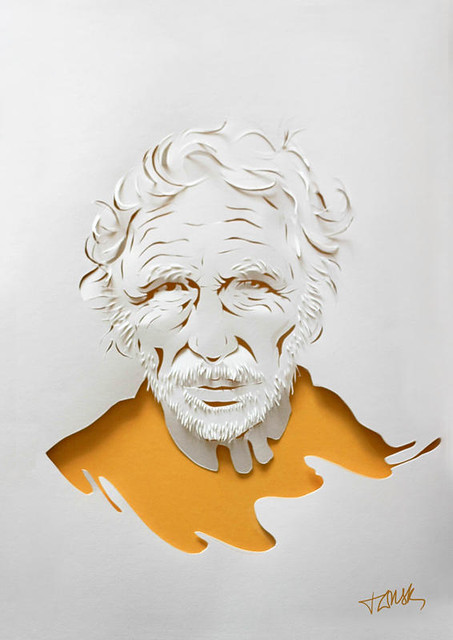
Again, I quite like the simplistic approach for the cover of my yearbook. I just want to have 

'Leeds College of Art
BA Hons Illustration
Yearbook 2016'

on the front in a fun handmade paper lettering quite like the one below - but then I realised that cutting the actual letters would probably be really fiddly and I don't want to make my life any harder than necessary.


So, I decided maybe it would be a better idea to invert the cutting process. So instead of cutting little pieces of letters I would do it like this instead:


The first page of the book, I want to put a quote - I like my quotes. They give me life.
Since we're basically pioneers of this course, I thought it would be nice to have a quote that sort of relates to us being pioneers. I'm not sure which one to pick yet:

“The person who follows the crowd will usually go no further than the crowd. The person who walks alone is likely to find himself in places no one has ever seen before.” 
― Albert Einstein

“Do whatever you do intensely. The artist is the man who leaves the crowd and goes pioneering. With him there is an idea which is his life.” 
― Robert Henri

"There has to be this pioneer, the individual who has the courage, the ambition to overcome the obstacles that always develop when one tries to do something worthwhile, especially when it is new and different."
― Alfred P. Sloan

"In a word I was a pioneer, and therefore had to blaze my own trail."
― Major Taylor

"You have brains in your head. You have feet in your shoes. You can steer yourself in any direction you choose. You're on your own, and you know what you know. And you are the guy who'll decide where to go."
― Dr. Seuss

Belinda Rodriguez

Found Belinda whilst I was going through the explore bit of Instagram and she's so cool! I want to make myself known as a paper artist too! haha. Anyway, I've been thinking how I would actually do the layout for my yearbook - I know that I want it quite simple and not too messy since I want to keep the focus on the actual paper characters and then I found Belinda's first paper cut book and I like how her paper illustrations are all simply on plain white or coloured backgrounds - makes it look quite elegant and smart.


Paper illustrations photographed on plain coloured backgrounds make it more fun looking! and we're all a fun bunch here on the Illustration course! I was also thinking of having everyone's names on the bottom of each pieces too - but I don't know now. I'll have to see how that'll look. or maybe I can just have a list of everyones name at the back of the book like a glossary type thing. 


 My first initial idea was actually to have some sort of frame around them like the ones below, but I wasn't sure if this would make it more expensive. I do still like the idea, but I'm not going to spend money if I can do it some other way.


Edit 15/01/16 - Belinda noticed me!

Inspiration?

Found these on Tumblr and reminded me of the Royal Opera House brief! I love these! If we were to go ahead with this brief I think I would want to be quite elegant yet in a style that would attract quite younger audiences too since that's what the brief wants you to do!

Celine Kim:

Glen Keane:

Phillip Light:

18/11/2015

Illustration x Photography

For the ROH brief, I still quite like the idea of combining illustration with photography since its quite different and maybe would make it stand out from the crowd and catch judges attentions. I found this video below which is a combination of animation and live action and it looks pretty cool! maybe we could even make some animated stuff!

17/11/2015

More visual references

Similar to the mixing reality with opera idea but here it's mixing past and present together.


more photos here: BuzzFeed