27/11/2014

Pan Macmillan Alice Brief - Crit

My initial conceptual development, ideas and visual development that I brought along to the first group critique, as well as examples of contextual references relating to my initial ideas to help clarify my intentions:


5 questions I asked my crit group:
  1. Which scenes in Alice do you find most recognisable? - motifs/imagery you associate with Alice?
  2. What colours do you associate with Alice?
  3. What would you do to make the project stand out?
  4. Do you think the particular style/aesthetic that I've started working in is appropriate for the audience?
  5. What would you suggest I do differently? - general suggestion?
The answers I got:
  1. Scenes: Tea Party, when she meets caterpillar, cheshire cat, Queen, when she plays croquet, whens she falls down the rabbit hole, when she grows large in the house and her arm hangs out the window.
  2. Colours: Blue and white, grass green, crimson red.
  3. Pick scenes that are not obvious, ones that not everyone would do.
  4. Yes, very appropriate - good that I'm still moving on and challenging myself with a new technique but still keeping true to myself with the way I draw.
  5. No - like where this is going.

26/11/2014

Pan Macmillan: Proposal

The problems I aim to solve are:
  1. To enchant a whole new readership
  2. To create a new cover for Alice
  3. To create up to two interior page illustrations for the book
In order to solve these problems I will:
  1. Recreate a new look for Alice - update current version.
  2. Identify 3 iconic/recognisable motifs/scenes/key moments from book and illustrate - my own interpretation (paper cut illustrations).
I will be aiming to communicate:
  1. 3 text passages/quotes from the book - key moments
  2. The book's content and convey information concerning both what the book is about and what the book is like - Establish character, setting, plot, tone/mood with book cover.
  3. Adventure, fun, colourful, playful tone/mood
To an audience of:
  1. Children age 5-9
  2. Parents of children 5-9
  3. Gift givers such as grandparents, aunts, uncles etc.

References

Light/candle animated gif by Charlotte Smith:

24/11/2014

Screenprint test

Productive day screen printing today! I did some practice tests with one of my illustrations - went pretty smoothly considering that this was my second time screen printing ever, and now I feel like I have a better understanding of how it all works and how the print room works. I printed on two types of paper to see how this would affect the finished prints. First 3 images printed on 'quality' paper found in studio:
My first print, I put too much black ink so the texture didn't really show up, though I'm not so sure if its a bad or good thing. I think it makes it a little bolder and intense, makes it stand out a bit more.
Next one, I didn't put pressure evenly.
After a couple more attempts, I got the hang of it - though still struggling to get everything to align perfectly - but my peers thought that it really isn't noticeable and only adds to the hand printed quality. 
This one I printed on the handmade paper purchased from the print shop. This paper is a lot thicker and in person you can tell that this paper takes in the ink a lot better but other than that, I don't think there is much difference in the result/quality of print. I will probably end up printing on the handmade paper though because its nice and sturdy. Today's been pretty fun and overall, I'm pretty happy with the way things turned out, I'm sure with a few more practice, I'll be able to sort all these misalignment problems out. Now I'm really excited to get the others printed and see them displayed side by side!

22/11/2014

Visual References

Follow Aghnia Mardiyah's board Paper Illustrations on Pinterest.

Charlotte Smith:

Morganna Wallace:

Cheong-ah Hwang:

Bomboland:

Final artwork


These are my final illustrations. In the thumbnailing process, I wasn't sure if I was making them too simple, but after finalising and cleaning them up, I realised that the simplicity, the idea of not giving away too much, helps to create a sense of mystery within my work which is what I wanted. I'm really glad that, as well as working together as a set, each individual illustrations is vivid enough to work by themselves - I posted them on my Tumblr, and people, including fans of Coraline, seem to respond well to them!

Final Decisions

Brief (what are you going to produce, how and for what reason)
A set of 5, A4 screen prints based on 5 scenes in the book - prints will focus on the protagonist and antagonist of the story. Illustrations based on the following quotes:
  1. "Then Coraline put her hand on the doorknob and turned it; and, finally, she opened the door"
  2. "The room was dark. The only light came from the hall, and Coraline, who was standing in the doorway, cast a huge and distorted shadow onto the drawing room carpet - she looked like a thin giant woman."
  3. "She picked at her teeth with a long crimson-varnished fingernail, then she tapped the finger, gently, tap-tap-tap against the polished black surface of her black button eyes."
  4. "At the end of the corridor the electric light went on, blinding after the darkness. A woman stood, silhouetted by the light, a little ahead of Coraline."
  5. "So you're back," said the other mother. She did not sound pleased. "And you brought vermin with you."

Background/Considerations (Tone of voice/mood, audience/context, form/format, colour/media, etc.)
My prints should appeal to existing Coraline fans (primarily children age 10+) but should also appeal to new audiences. This will be achieved by giving the audience a sense of what the book is about and its genre. To communicate a sense of mystery and the book's darker themes/genre, my prints will be black and white, a reminiscent of the film noir visual style, with an added splash of colour. Also working primarily with shape, combined with a touch of texture to enhance the atmosphere of the illustrations. I will be working towards A4 size in portrait format. I will not be using any type/including the quotes in my prints.

Deliverables (what exactly do you intend to submit - quantity, format, scale etc.)
A set of 5, A4, in portrait format, 2 colour screen prints:
  • First print, b/w with mustard yellow for her jumper
  • Second print, pure b/w
  • Third print, b/w with deep crimson red for the lips and fingernails
  • Fourth print, pure b/w
  • Fifth print, b/w with muted blue for her jumper
These are also the colours I will be using for my teaser trailers, moving pictures brief.

Interim Deadlines
Finalise all artwork by Monday
Separate artwork (positives) by Tuesday
Prepare screens
Do test pieces on different types/quality of paper

21/11/2014

Printed Pictures Crit - Concept Review

Comment on the selection of themes, content, concepts or messages (are they specific enough and are they appropriate to the author, texts or research)
  • Clear quotes linked to author.
  • The use of the light and dark gives the work an eerie feeling and reflects the atmosphere/dark themes of the story. 
  • Thumbnails give a clear sense of the story, also based on text in book.

Comment on the visual concept of the proposal (are the decisions about aesthetic, media, colour, appropriate to the intended tone of voice, mood and /or concept)

Appropriate research into artists work and have collected enough references to give idea into the intended tone of voice and mood. The light and shadow/dynamic lighting create a sense of fear (e.g darkness - the unknown), and again reflects the atmosphere of the story. The imagery/drawings are already vivid and speak for itself. They would work without text, but some compositions might benefit from a little bit of text - so make a decision about this, try it out and see.

Comment on the clarity with which the audience and or context has informed decisions relating to format, scale, media and content.
  • Appropriate to identified audience
  • Key motifs/scenes would allow existing Coraline fans to instantly recognise/relate to the work.
  • The proposed aesthetic would also appeal to new audiences - own style and not a rip-off of the artwork of the screen adaptation.

Comment on the extent to which the planning of time and resources has been effectively considered in order to enable the production of the proposed work in the time available. (are the action plans and project management sheets specific with regards to workload, deadlines and timescales)
  • Deadlines considered
  • Blog is up to date
  • Got a clear sense of direction regarding what to do next - do it.

What do they need to do?
  • Decide on which thumbnails to develop
  • finalise artwork
  • Decide whether to use text/type or not
  • Experiment with colours/textures etc.
  • Do test pieces of screen prints

20/11/2014

Thumbnails

Inspiration and reference images:

Follow Aghnia Mardiyah's board Light and Shadow on Pinterest.


I tried to keep my compositions pretty simple and straight forward, but not sure if they're actually too simple that it makes them look a little dull - could I maybe add text to them? Also not sure which ones I should pick to develop further.. will have to ask my peers for their opinions in the crit tomorrow.

19/11/2014

Ideas


I've been really inspired by Jon Klassen's work lately; I'm so mesmerised by the dynamic lighting and textures in his work, I find it really beautiful. To me, the visual aesthetic really reflects the mood in Coraline - there is a mystery, fantastical, highly atmospheric feel to his work which makes me want to try and create something with a really strong light and shadow contrast for my prints.

Also, work with similar feeling by Roman Muradov using traditional/analogue medias:

Character Design

As the main character, I needed to figure out what my version of Coraline was going to look like before going any further with my moving and printed pictures. I don't want her be an exact copy of the screen adaptation, but I also want her to appeal to people who are fans of the movie. So for them to instantly recognise the character, I decided to adopt the recognisable, Coraline bob haircut and the turtleneck that people who have seen the movie associate her with.

As a character, the Other Mother's appearance was kept a mystery - never really been specific with details in the book, except that she looks like Coraline's real mother, but white as paper, taller and thinner with black button eyes. In my prints I want her to remain as mysterious as possible - maybe make her a shadowy figure? I think this will add to the dark atmosphere and keep the audiences wondering.

Visualising texts


As suggested in the moving pictures crit the other day, I should blog more of my sketchbook to show how my visual journal work have started to inform the work I do for studio briefs 2 and 3. This is a page where I have started to visualise the text/quotes from the book - illustrating pieces of the story is something that I have proposed to do for my moving and printed pictures brief so it is important that I keep doing this and experiment in order to develop my own sense of style and tone for the story. I'm really favouring the limited colour palette here and I like working in both line and shape as shown above.

18/11/2014

Printed Pictures References

Follow Aghnia Mardiyah's board Screen Prints on Pinterest.

At the moment I am really leaning in towards using the combination of black with one or two other colours for my prints. Sticking with this kind of colour palette would be most appropriate to communicate the kind of atmosphere that is given off in Coraline and would also make the aesthetic consistent with my moving pictures brief. I really like the textural quality and the simple compositions of these pieces, and the way they focus on the characters. I also love the shape of the second image - there is a handmade quality to it, it's really charming.

Moving Pictures Crit - Concept Review

My action plan for this week.

Comment on the selection of themes, content, concepts or messages (are they specific enough and are they appropriate to the author, texts or research)
  • Clear quotes linked to author. 
  • Concept is clearly linked to author. 
  • Clear, specific idea - Clear storyboard

Comment on the visual concept of the proposal (are the decisions about aesthetic, media, colour, appropriate to the intended tone of voice, mood and /or concept)

You've collected enough references along with your visual journal for us to have a clear idea of your aims and what you intend to produce. You've looked at references that illustrate the moods and atmosphere you wish to create.

Comment on the clarity with which the audience and or context has informed decisions relating to format, duration, media and content.
  • Identified clear audience
  • Need to insure it appeals to both adults and kids
  • You've put that it's like a teaser trailer which gives it context.

Comment on the extent to which the planning of time and resources has been effectively considered in order to enable the production of the proposed work in the time available. (are the action plans and project management sheets specific with regards to workload, deadlines and timescales)
  • You've produced a very clear work timetable
  • You're clearly very organised.
  • You've considered deadlines
  • Blog's up to date

What do they need to do?

Add some of your own work from visual journal on to blog. Your work from journal informs your ideas so show this on blog - page with hands and red nails is a turning point - blog it.

17/11/2014

Visual References - Jon Klassen

I came across Jon Klassen's work on my regular trip to Waterstones to look at some children's books for their illustrations. I caught the sight of The Dark by Lemony Snicket and was instantly enchanted by the illustrations. The visual quality of his work reminded me so much of the atmosphere given off in Coraline. When I got back, I decided to look him up on the internet and found that he actually worked on the concept art for the movie adaptation of Coraline - so awesome.

And then I came across the trailer for the book:
It's interesting to see how they have made his illustrations come to life just by a slight change in position and size of the images. Like the SETA book trailer I've talked about in the previous post, maybe this is also something I can consider doing to make the production of my trailers more efficient.

The images below are more of Klassen's work. I love the way he uses little to no lines, subtle, earthy colours, shape, texture and his lighting is really beautiful. I am leaning towards this kind of visual aesthetic for my trailers as using simple shapes would come really handy in the animating process and the textural quality would also add to the creepy, dark atmosphere of the story.
I also really like this multiplied, collage-looking effect.

His work in progress - his textures are created by himself

16/11/2014

Storyboards

I have decided that I will be making 3 teaser trailers for the book and I am going to aim for each one to be 20 seconds long. I have chosen to animate these scenes (below) as they paint a really clear picture in my head whilst I was reading the book. To me, the first scene is where the story really begins - the point in which causes the story to develop further, where it goes from bad to worse. so I will start my series of trailers with this. 

I hope to gain the audiences attention by creating suspense and mystery in each one of my animations - The trailers will show really brief glimpses of some of the scenes that happen in the book and cutting it short to create a sort of cliff-hanger type feeling that will hopefully leave the audience wanting to know more, wanting to know what is really happening, wanting to know what happens next.

14/11/2014

Textures - Bitmap

I wanted to find out how you can add textures for screen printing and I came across this video tutorial/class. I decided to join and it's pretty useful stuff so far. Link to video below:
Textures and Halftones for Screen Printing

Turning images into pure black and white:
(example image from google, credit to owner)
make it grayscale:
adjust levels to get more of a contrast:
Image > Mode > Bitmap >Diffusion Dither
When you zoom in, it will be pure black and white.

To separate the black from the white (or vice versa):
Turn image back to grayscale mode and unlock layer. Use the magic wand tool with 'Contiguous' unchecked and click on the white area. This should select all the whites and then simply delete, which should leave you with the blacks on transparent background

With this you can then play around with colours on separate layers!
Change to RGB colour (or CYMK) mode first.
Add a new colour layer. 
To change colour of the black, go to effects (fx) > Colour Overlay and choose colour
and voila.

Contextual References

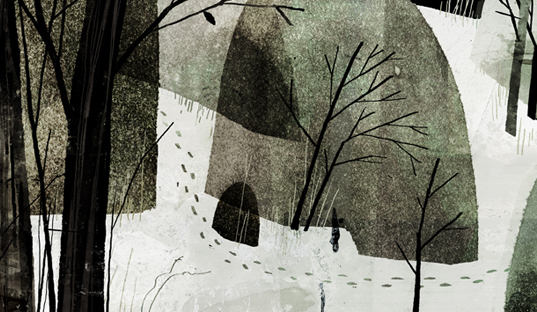
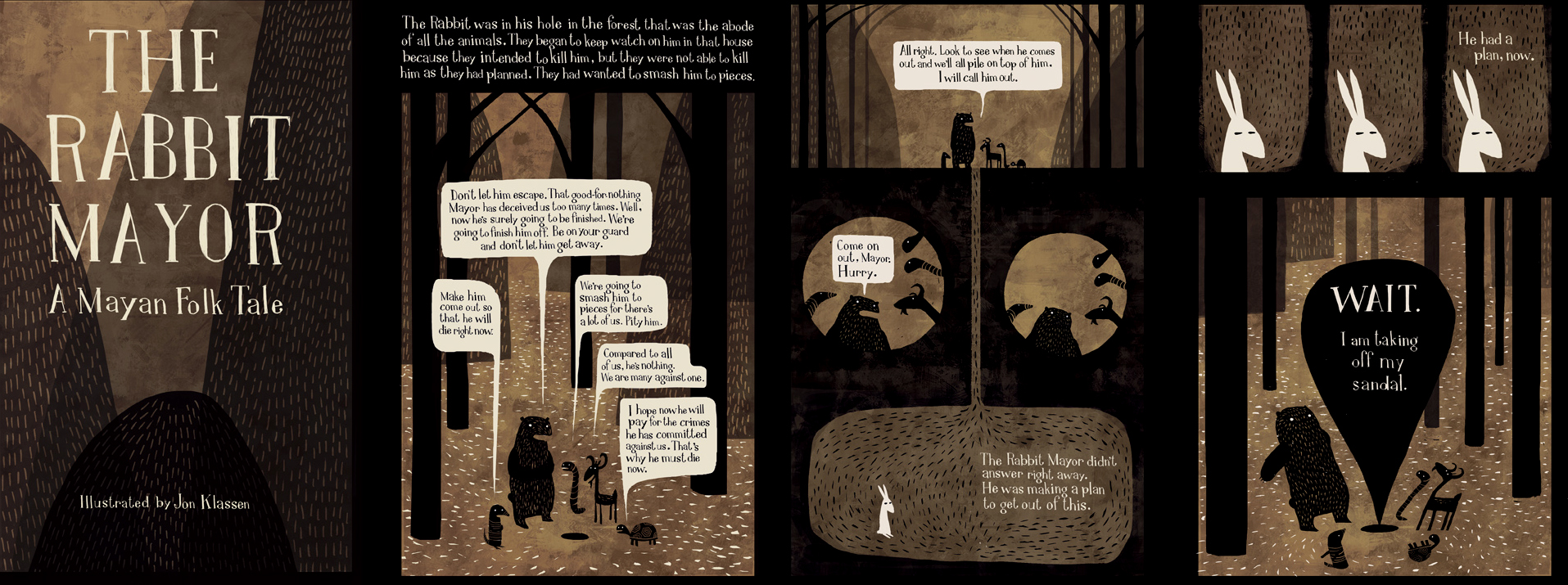
I really like the simplicity of this one, the use of bold, simple shapes and the harmonising colour palette that is used is very effective and quite eye catching and is appropriate for the book's target audience. The slow pace of the movement starting with the landscape which then focuses on the characters gives it a real sense of adventure and mystery. It doesn't go in too deep into the story and only shows a really brief glimpse of what the book is about, its tone, and what its like, which can make people want to pick up the book and read for themselves.

Shh! We have a plan: Trailer from chris haughton on Vimeo.

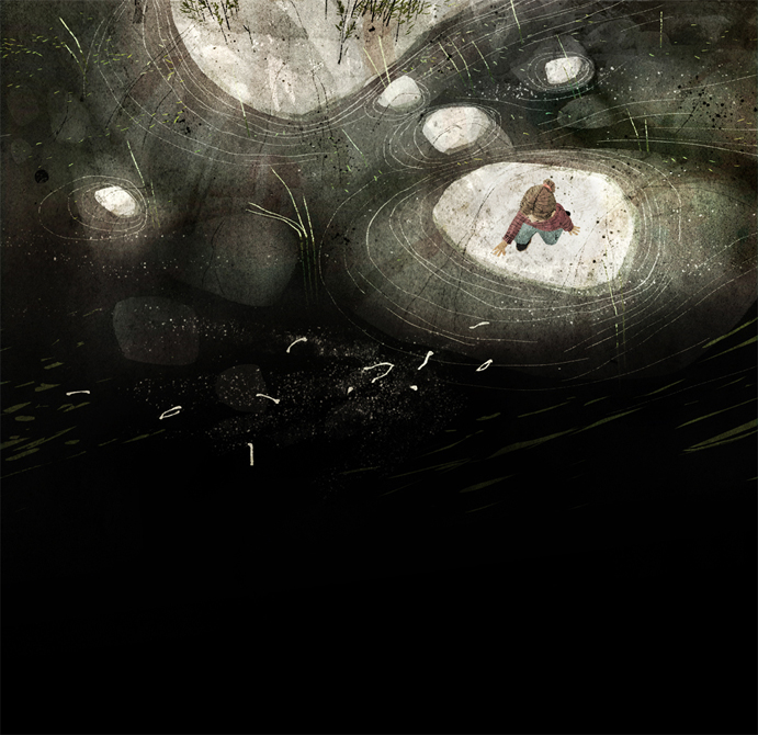
The lighting/glow and use of gradients in this animation I think works really well in creating a sombre, mysterious, and a kind of ethereal feel. Again, there is something about the slow/calm pace and the smoothness of movements - it makes it feel highly atmospheric and it keeps me wanting to watch the video. I think this is something I can look at when making my animation, as I think it will help create that spooky, mysterious atmosphere which I think will help to attract and keep the audiences attention.

Between Bears from Eran Hilleli on Vimeo.

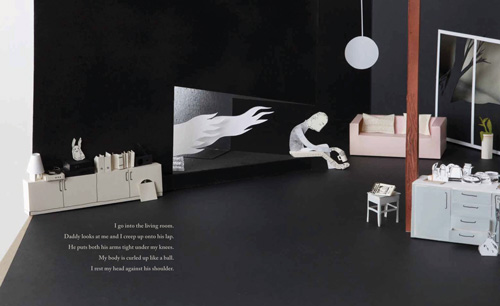
The composition is very simple and straightforward in the video below which makes it so effective in the telling of the story. The light surrounding the images/characters against the dark background acts as a spotlight, which helps to draw the audiences attention more, helps you to focus your attention only to that particular thing and to control the eyes movement throughout the video. Again there is a sombre, dark atmosphere that you feel when watching this which I think is due to the colours and textural qualities of the images.

Stickboy // Animation Montage from Giant Ant on Vimeo.

Like the video above, I think the choice of colours and textural quality in the book trailer below is very well thought out to bring about the feeling and tone of the story. I really like the limited amount of movement within the set of images/scenes in this video - I think they've mostly moved the 'camera' around for the transition of scenes and added little bits of movement (like smoke and the scarf blowing in the wind) to those scenes, which to me looks like still images, but because the 'camera' is moving it looks like its also actively moving. This, I think works just as well - and maybe more time efficient?

SETA - Book Trailer from Enzo Lo Re on Vimeo.

I've put this one in because it is a very short and snappy book trailer, which is something that I intend to create for this brief. I really like that the animation is very simple - looks like they've mostly used the position key frames in After Effects - and that its only in black and white, and with the combination of music, it gives it a really creepy vibe. It sort of reminds me of Coraline a lot.

insideout book trailer 2 - "Planning" from HELLO, SAVANTS! on Vimeo.

Things I need to consider:
  • Pace 
  • Colour
  • Shape
  • Texture
  • Composition
  • Text
  • Digital?
  • Hand drawn?
  • or a mix of both (like the last video)?
  • Audio?

11/11/2014

Children's Book Illustrations Research

Existing 'Alice' book covers/illustrations:

Follow Aghnia Mardiyah's board Alice on Pinterest.

Existing 'successful' children's books illustrations:

What I think makes a good children's book cover/illustration:
  • Appropriate use of colour
  • Bold, varied and full of movement
  • Identifiable characters/establishes character
  • Universal appeal
  • Strong/unique concept - Establishes setting/mood of story

Children's book illustrations that really caught my eye:
I love how these illustrations (below) have a 3 Dimensional feel to them - possibly photographed cut paper sets - I love the natural lighting. From my trip to Waterstones a couple of days ago to browse through some children's books (as you do), I've noticed that there aren't a lot of book illustrations that are made like this, its different to the book illustrations that you see nowadays which makes it so refreshing to look at and it stands out a lot more for me than the other ones that I have seen. From the images I have gathered so far, I have not seen an Alice book cover thats been made in this way, maybe this is something I could do?