27/12/2014

Teaser 3

hand test:
I feel like this one would look and flow better without the last frame before the title, however if I get rid of it, it would end up being a lot shorter than the other two trailers - would this be a problem? or should I just leave it the way it is and decide after I combine audio with it?

24/12/2014

Teaser Progress

Every frame in my teasers were made separately on both Photoshop and After effects and finally put together/composited on After Effects which I found a lot more manageable and time efficient than trying to make it all in one go.
Whilst compositing my first teaser on After Effects, I found that some of the frames that I initially wanted to include might not really be necessary, so I decided to take out some parts and shorten my animations to 15 seconds instead of 20.

(Note: Final animations will be uploaded to Vimeo, so higher quality)

Action Plan:
  • Produce third teaser
  • Figure out audio to use

19/12/2014

Paper-cut Lettering

I was looking for inspiration on how I can do the lettering for the title and found Kate Slater's work. I like the ones that have pattern and texture incorporated into the letters instead of it just being a plain colour - I think it adds more of an interest to it. I also like the visible shadow created by the letters. I think adds depth to the piece which again makes it more interesting!
Then I also found her working process for her illustrations - its always interesting to see how people work!

Just a thought, but I saw this on Pinterest and thought, what if I turn some of the letters into motifs from the book? make it into a bottle with a 'Drink Me' label hanging off of it, or a tea cup, or playing cards, and so on. Or would this make it look really messy and out of place? hmm?

17/12/2014

Alice Development

Strong contrast in value.
Light against dark to make character more prominent/a focus subject.
I decided to try out different colours to determine what kind of colours I should use for the cover that I have come up with at this point in time, and to actually see if the idea would work as a cover. I tried to pick colours that are quite gender neutral so it would appeal to both genders. I asked a couple of people to choose which one they like best and from what I have gathered so far, people like the red/purple-red - nice contrast between the dress and the curtain was the reason that mostly came up.

Whilst going though my personal tumblr account, I came across something that really looked similar to what I was doing. Kevin Kidney was hired to create a promotional campaign for a holiday entertainment company using paper sculpture. His process for this poster can he found here.
It's really interesting to see what goes on behind the scenes, hopefully this will allow me to understand more about the process and allow me to pick up some tips and tricks.

Also found Faye Rogers' process, which I thought might come useful to me later.

11/12/2014

Alice: Progress Review


Feedback based on Presentation Boards (above):
At this moment in time, I am really pleased with the feedback that I've got. I'm glad people think I'm heading into the right direction with the idea and visual aesthetic to suit the intended target audience. The progress review not only helped me to see what I'm doing right, but I was also given some suggestions that I might want to consider, which might improve what I have so far. For example, I totally agree that maybe I should look at incorporating more movement into my images for a stronger impact - I will look at other scenes and try thumbnailing some more ideas.

Expectations for next peer review (what my crit group came up with):
  • Visual development towards final idea
  • Resolved context
  • Reference materials gathered
  • Presentation boards updated
  • Resolved aesthetic - colour palettes etc.
  • Feedback from target audience
  • Deliverables clearly stated
  • Time planning up to deadline
  • Specific requirements e.g audio/motion
  • Process and production tests - stock, print, methods

Expectations for next peer review (whole group):
  • More resolved visual concepts
  • More appropriate/considered visual aesthetic
  • More professional/clearer presentation
  • Clear timescales and deadlines
  • Refined brief (including specific audience)
  • Production tests
  • More work
  • Mock ups
  • Contextualisation
  • Existing feedback
    • Confirmed decisions
    • A set of questions to direct feedback

09/12/2014

Interim Screening & Peer Review

Comment on the practical development of wok for the Moving Pictures Brief. Is there sufficient evidence of practically investigating selected processes and techniques.
  • Clear and directional development
  • Making the formulation of ideas look smooth and effortless
  • Great contextual references, clearly has informed your work.
  • Really effective atmosphere and mood achieved with your media.

Comment on the practical development of work for the Printed Pictures Brief. Is there sufficient evidence of practically investigating selected processes and techniques.
  • Colour scheme is so effective, works well if not better than contextual references.
  • Composition has been worked out and resolved in order to be effective.
  • Set works well together.

Comment on the clarity with which the development of concepts, ideas and practical solutions has been documented on the studio practice blog.
  • Step by step - extremely clear and well organised
  • Really well documented

Comment on the extent to which the planning of time and resources has been effectively considered in order to enable the production of the proposed work in the time available.
  • There has been a lot of time allocated to thinking conceptually as well as development.
  • It's incredible what you've done at this time!

Strengths
  • Printed pictures - really professionally finished and all clearly part of a set
  • Animation - really strong development work.
  • Animation conveys the atmosphere of your pieces really well
  • Clear direction

Improvements
  • Get ideas for other animations up on blog
  • Keep up level of work!

08/12/2014

Coraline Teaser 1 - Progress 1

Coraline Teaser 1 - Progress 1 from Aghnia Mardiyah on Vimeo.

I started working in After Effects today and came out with this. This is still a work in progress and I intend to add some more to it at the beginning. It took a lot of figuring out but I managed to created something that I'm pretty happy with.

Final Prints

My target was to get all my prints sorted before we break up for Christmas, and having done that last Monday made me feel really on top of things! When I showed them to Eleanor the next day I was really glad that she thought my prints work really well as a set and I'm glad that she noticed and liked the order that I've put them in - because I really did put some thought into it, so that the direction/flow of each print meet in the middle with the Other Mother piece.
I asked what she thought about some of the prints in regard to the print quality - she suggested that (if i were to sell them) I may want to reprint some of them because of some patchiness here and there, which I agreed as it made it less presentable. I also forgot about blocking some of the registration marks for the prints above - after talking to Matt about this, he told me that there is a way to create registrations marks just off the frame of the artwork so it won't affect it - but I had already exposed my screen and I didn't really want to spend a lot more money on it, but this is definitely something that I will consider next time I screen print. I was able to reprint these on Friday.
I am overall happy with my prints and I feel like I have achieved what I proposed which was to illustrate my 5 chosen quotes from the book and communicate a sense of mystery and the book's darker themes/atmosphere. I feel like I have achieved that with the dramatic lighting and colour scheme.

07/12/2014

Pan Macmillan: Alice

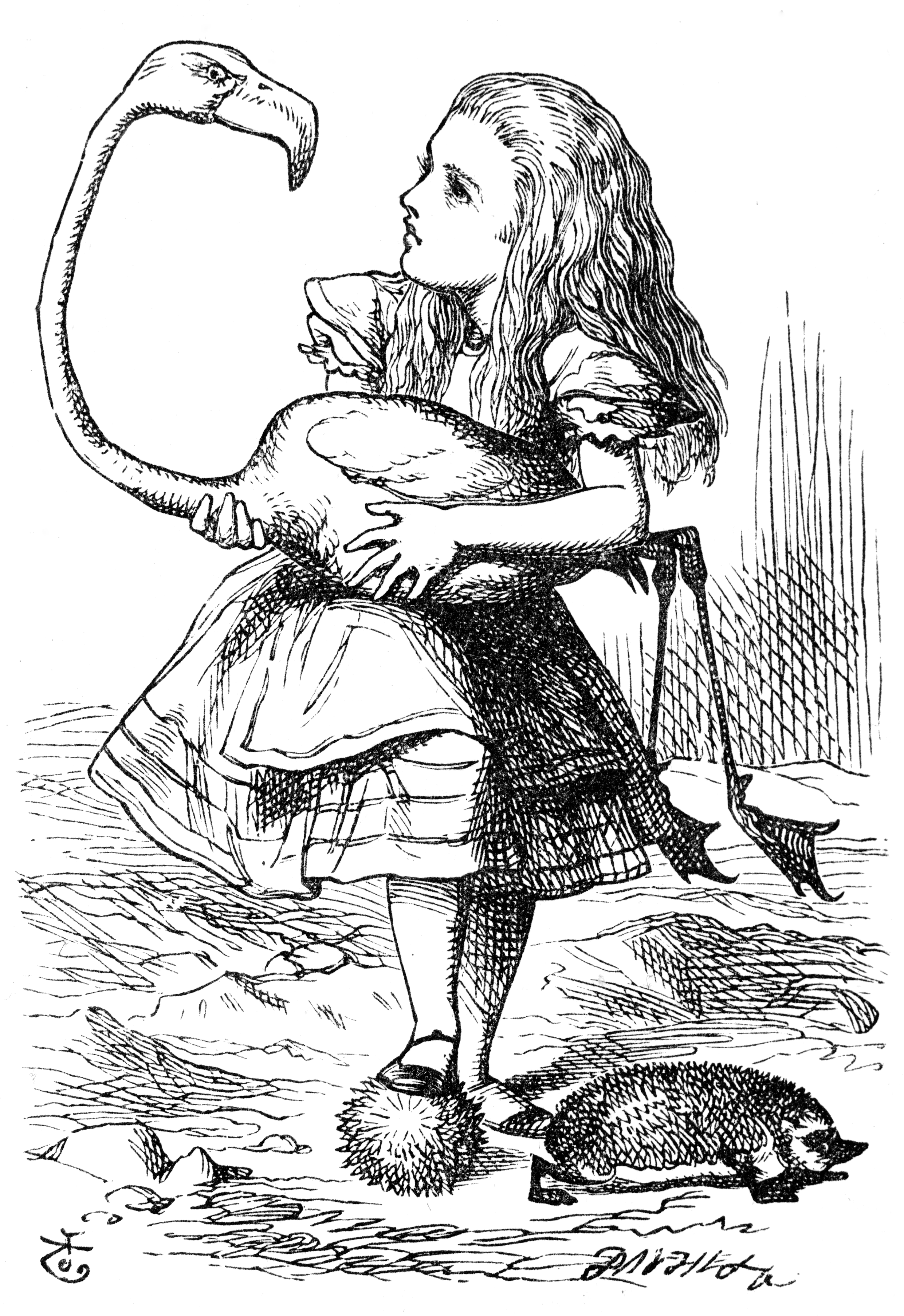
I've decided that I will base my paper illustrations on the original Alice illustrations by Sir John Tenniel. Initially, the scene I wanted to do for the cover was where she meets the caterpillar because it is a scene that is really iconic and one that I thought would grab the attention of those who don't know the story because of how odd and striking the imagery is. But because there is just too much going on, I wasn't sure if I would be able to fit the title in and make the composition look good. Instead, I have decided to illustrate the scene where she finds the little door - this will be fully illustrated (including background and other details). The imagery is fairly simple, yet it still establishes character and gives the audience an idea of the story, and it would allow me some space for title and other details that would go on the cover.
Unlike the cover illustration, the two interior page illustrations will have plain backgrounds, similar to Morgana Wallace's illustrations. The main reason for this is so that I can put more time into the cover. For this, I will be illustrating the scenes where the gardeners paint the white roses red and when Alice plays croquet. These scenes were the ones my peers suggested I should do in the previous crit, and I also think these would translate to paper illustrations nicely.

Test

05/12/2014

Colour Key

Painting/colour sketch that illustrates what a particular sequence should look like in my animation. Visual aesthetic inspired by BANG BANG ! TRAILER from Julien Bisaro on Vimeo.
Still/artwork of “Bang Bang !” french animated short-film directed by Julien Bisaro

Teaser 1:

02/12/2014

Type

I like how the icebergs here make up/is a part of the title of this animation. For my trailers I want the title of the book to incorporate the button, which is a recurring and important imagery in the book.

In the previous drawn animation task, I wanted the title to look like it was made out of thread which was why I chose the first style because the letters are all joined up, which made it easier to do so. However after looking back at it, I wasn't really sure if this style is appropriate, if it would reflect the mood that I want to get across because it looks a little sophisticated and delicate. Then I tried a different style, but I thought it still looked a little too tight - neat - it suggests order and looks quite playful and welcoming because of its roundness. The slight irregularity and sharpness of the third one does a better job of implying chaos, complete disorder and madness which reflects the feeling of the story better. This is the one I will use in my teaser trailers.

https://vimeo.com/66895467
https://vimeo.com/39688229
https://imeo.com/39688229

27/11/2014

Pan Macmillan Alice Brief - Crit

My initial conceptual development, ideas and visual development that I brought along to the first group critique, as well as examples of contextual references relating to my initial ideas to help clarify my intentions:


5 questions I asked my crit group:
  1. Which scenes in Alice do you find most recognisable? - motifs/imagery you associate with Alice?
  2. What colours do you associate with Alice?
  3. What would you do to make the project stand out?
  4. Do you think the particular style/aesthetic that I've started working in is appropriate for the audience?
  5. What would you suggest I do differently? - general suggestion?
The answers I got:
  1. Scenes: Tea Party, when she meets caterpillar, cheshire cat, Queen, when she plays croquet, whens she falls down the rabbit hole, when she grows large in the house and her arm hangs out the window.
  2. Colours: Blue and white, grass green, crimson red.
  3. Pick scenes that are not obvious, ones that not everyone would do.
  4. Yes, very appropriate - good that I'm still moving on and challenging myself with a new technique but still keeping true to myself with the way I draw.
  5. No - like where this is going.

26/11/2014

Pan Macmillan: Proposal

The problems I aim to solve are:
  1. To enchant a whole new readership
  2. To create a new cover for Alice
  3. To create up to two interior page illustrations for the book
In order to solve these problems I will:
  1. Recreate a new look for Alice - update current version.
  2. Identify 3 iconic/recognisable motifs/scenes/key moments from book and illustrate - my own interpretation (paper cut illustrations).
I will be aiming to communicate:
  1. 3 text passages/quotes from the book - key moments
  2. The book's content and convey information concerning both what the book is about and what the book is like - Establish character, setting, plot, tone/mood with book cover.
  3. Adventure, fun, colourful, playful tone/mood
To an audience of:
  1. Children age 5-9
  2. Parents of children 5-9
  3. Gift givers such as grandparents, aunts, uncles etc.

References

Light/candle animated gif by Charlotte Smith:

24/11/2014

Screenprint test

Productive day screen printing today! I did some practice tests with one of my illustrations - went pretty smoothly considering that this was my second time screen printing ever, and now I feel like I have a better understanding of how it all works and how the print room works. I printed on two types of paper to see how this would affect the finished prints. First 3 images printed on 'quality' paper found in studio:
My first print, I put too much black ink so the texture didn't really show up, though I'm not so sure if its a bad or good thing. I think it makes it a little bolder and intense, makes it stand out a bit more.
Next one, I didn't put pressure evenly.
After a couple more attempts, I got the hang of it - though still struggling to get everything to align perfectly - but my peers thought that it really isn't noticeable and only adds to the hand printed quality. 
This one I printed on the handmade paper purchased from the print shop. This paper is a lot thicker and in person you can tell that this paper takes in the ink a lot better but other than that, I don't think there is much difference in the result/quality of print. I will probably end up printing on the handmade paper though because its nice and sturdy. Today's been pretty fun and overall, I'm pretty happy with the way things turned out, I'm sure with a few more practice, I'll be able to sort all these misalignment problems out. Now I'm really excited to get the others printed and see them displayed side by side!

22/11/2014

Visual References

Follow Aghnia Mardiyah's board Paper Illustrations on Pinterest.

Charlotte Smith:

Morganna Wallace:

Cheong-ah Hwang:

Bomboland:

Final artwork


These are my final illustrations. In the thumbnailing process, I wasn't sure if I was making them too simple, but after finalising and cleaning them up, I realised that the simplicity, the idea of not giving away too much, helps to create a sense of mystery within my work which is what I wanted. I'm really glad that, as well as working together as a set, each individual illustrations is vivid enough to work by themselves - I posted them on my Tumblr, and people, including fans of Coraline, seem to respond well to them!