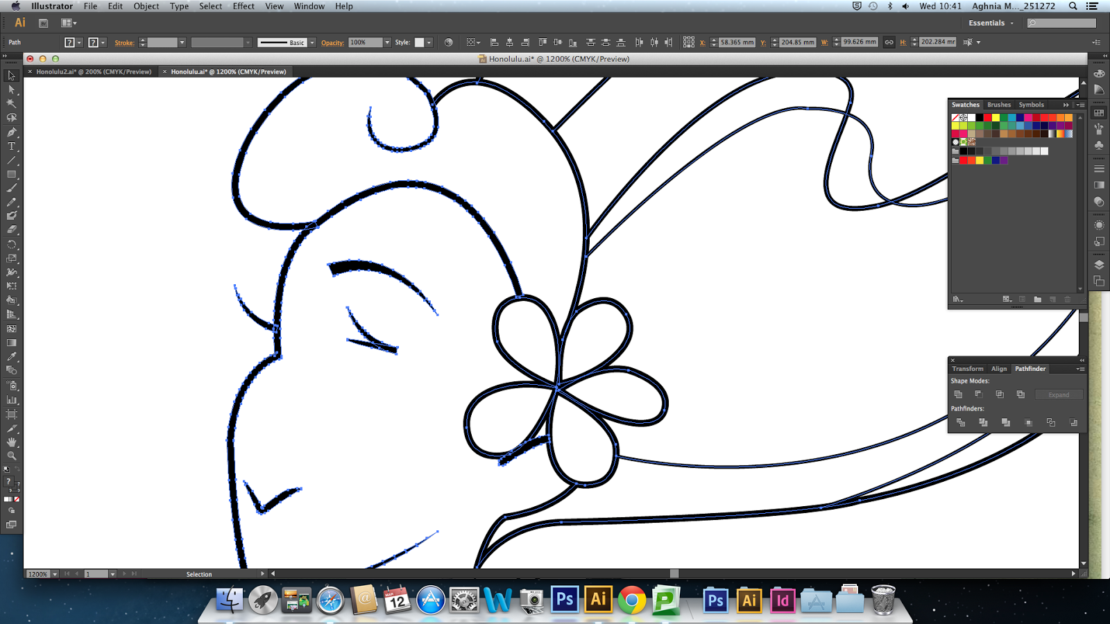
This morning I asked Mike if he knows how to stop the live paint group changing the appearance of my lines, he told me that I needed to expand the appearance of my paths first before using the tool so that each of the paths that I made appear tapered actually becomes a shape with anchor points around it (select all > Object > Expand appearance)
So when making it into a live paint group, it recognises it as a shape and not a single, open path/line:
Surfboard or no surfboard? - This is the coloured in version. I decided to add the coloured shape so that it won't just be a plain white background - also something that can make my postcards work more as a set (link between the placement of characters and the coloured shape). I chose the colour blue here, as Hawaii is known for its blue skies and beaches. At the moment it looks really flat and boring. Illustrator is really testing my patience haha
I added more colours to add a little more dimension to it, but I still think it looks a little flat. So I asked James how to ungroup my shapes from live paint group so I can add gradients to what I've done so far (Select all > Object > Expand > (tick object only) and then Object > Ungroup (twice):
 |
| I added separate gradients to shoulders, neck etc as well |
After long laborious hours of figuring out just how to block in colour, I think the gradients make it all worthwhile, and so much better! I changed the colour of the outline as well, so it's not black - so the contrast between the line and colour isn't as intense, also to make it look less like a thing from a colouring book
I found that the gradient tool works a little different in Illustrator to the gradient tool I'm used to in Photoshop. It was rather confusing at first, like how to change the directions of the gradients but then I understood it better after a while. I also decided to have the outline of my rectangle a different colour - just to add something more to the look of my postcards. For Beijing, I used yellow and red as it is the colour of the Chinese flag. I kept the yellow of the rectangle quite pale here as the blue I used for Honolulu is quite pale as well


No comments:
Post a Comment