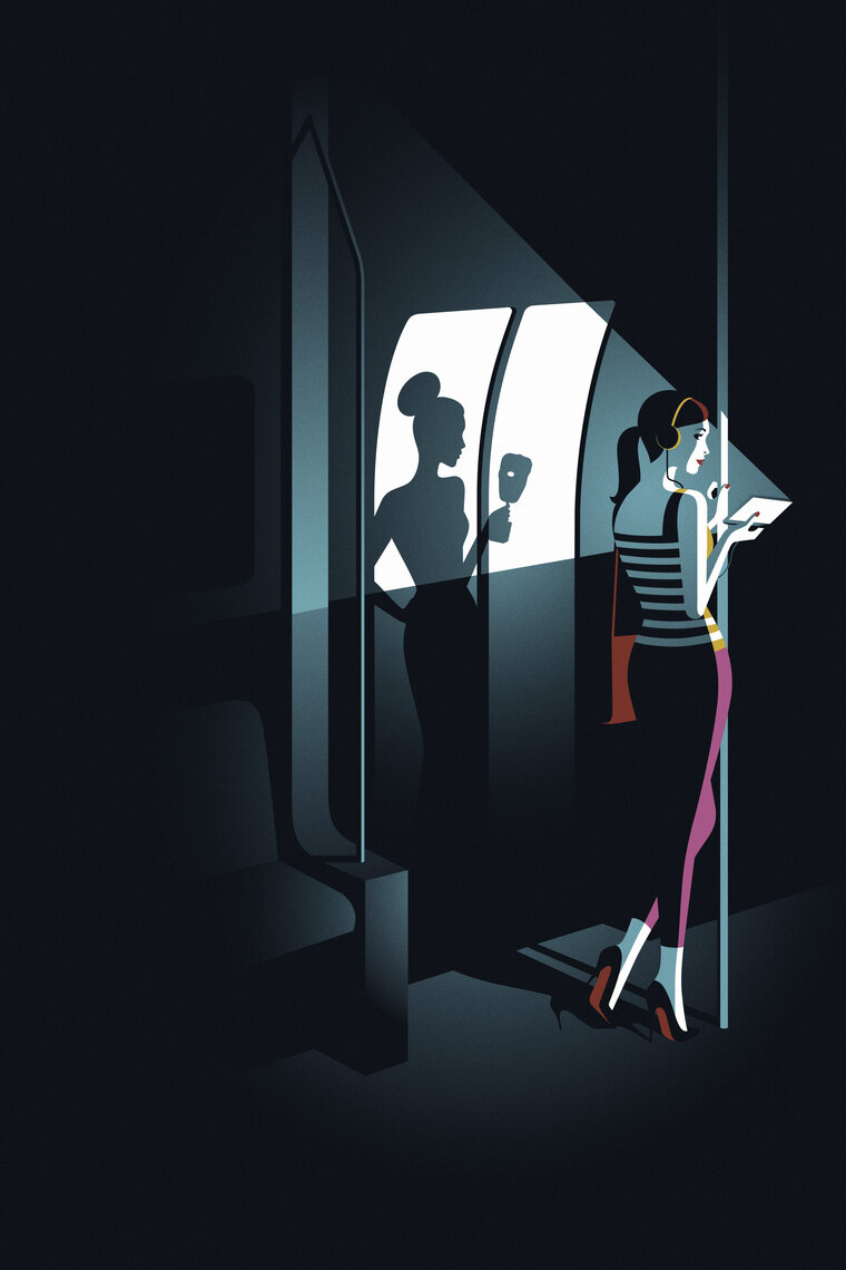
I found another illustrator who used the idea that is quite similar to mine - Malika Favre kinda used the same mirror/reflection imagery in her work for the BAFTA (below) - which look oddly similar to what I did for the Coraline brief I produced last year! weirdddd..
I like the simplicity of her illustrations - the simple, quite straightforward compositions and limited colours make it easier for the eye to focus on the characters - also make them so much more sophisticated and therefore more suitable for the the BAFTA and also for the target audience. I think this is something that we should also take into consideration with our own posters since we want to be attracting similar markets.
I just did a further research of this and just found out that the BAFTA ceremony was actually held at the Royal Opera House in London! hahaha closer to home than I originally thought.


No comments:
Post a Comment