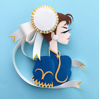
Paper illustrations photographed on plain coloured backgrounds make it more fun looking! and we're all a fun bunch here on the Illustration course! I was also thinking of having everyone's names on the bottom of each pieces too - but I don't know now. I'll have to see how that'll look. or maybe I can just have a list of everyones name at the back of the book like a glossary type thing.
My first initial idea was actually to have some sort of frame around them like the ones below, but I wasn't sure if this would make it more expensive. I do still like the idea, but I'm not going to spend money if I can do it some other way.
Edit 15/01/16 - Belinda noticed me!


No comments:
Post a Comment