I decided to go back and play around with this idea. The target and arrows idea was mentioned in the crit session because it was said to be 'wonderfully simple' - so I decided to see how this would look when combined with another idea. Still not quite sure if this works just yet..
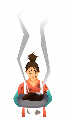
I went and looked at how the media and the minimal shapes could be improved - Here, I used the polygonal lasso tool to enhance and emphasise the shapes even more. I also decided to try out adding tone with the gradient tool instead of using the textured brush. I really like the aesthetic of this - I think that it makes it look more playful with the shapes more visible which I think makes it more eye catching and different
Type - layer effect:
 |
| Outer Glow |
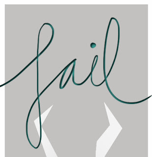 |
| Inner Shadow |
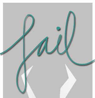 |
| Drop Shadow |
 |
| Bevel & Emboss |


No comments:
Post a Comment