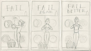
I chose this quote as the message that it is communicating is similar to that of the lesson that is taught in one of my favourite Disney movies 'Meet the Robinsons'- To never give up and Keep moving forwards - Walt Disney
Reference images:
Feedback from peers, strengths:
- Diverse ideas and concepts executed with understandable clarity
- Really fun and playful, relatable concepts
- Good use of sequence to portray the 3 parts of the quote
- The one with arrows is wonderfully simple
- Uniformity of the 3 images is great
- Images considered and designed to compliment format shape
- Really like the minimal shape based figure with textural qualities
- The choice of colours in the digital ones - simple colour palette, really effective and eye catching
Suggestions:
- Could subtly show progression of time like seasonal changes etc.
- The formats are currently quite close to 'A' format, so look into more shapes
- try some unusual format ratios- convey the idea of an on going failure and improvement with a really long format?
- Resolved images should be digital (as your experimentation shows) you're pretty strong in this area
- Perhaps get my own textures to use
- Try some more medias
I found coming up with ideas for this brief quite challenging for me because of how open the brief is. I find that I produce more ideas when the brief is more structured, like the editorial one.
What I think works well:
- I do like how the ideas that I've produced so far are simple and clear, so that the audience can understand what I'm trying to communicate straight away without difficulty.
- I think how relatable the concepts are to most people makes this more light hearted and humorous, making the quote positive (motivational- to keep moving forwards) instead of negative.
- I feel that the minimal shapes and playful and bold combination of colours really works well with the simplicity of the idea - I will practice more with making pictures out of minimal shapes, look more into complimentary colour combinations, and experiment more with different textures- maybe bring in my own scanned in textures?
What could be improved?
- I feel like I should take advantage into this openness of scale and format so I think that my choice of format ratio could be looked into more as most of them are quite close to the standard 'A' format


No comments:
Post a Comment