31/01/2016

Deciding Composition

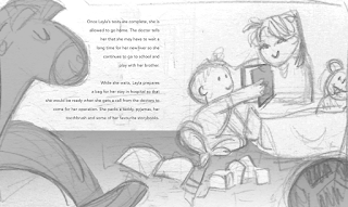
I started sketching out my other chosen text (even though I haven't finished my first one yet). I did a couple of thumbnails for this and couldn't decide which one out of the two best ones (in my opinion) that I liked better. I decided to see what they both would look like laid out in the book format and with the text. I thought it was a good idea that I did this because now it's clear which one is the better one (in my opinion), which is the second sketch!

I liked the first sketch because it's quite simple. Originally, it didn't have this much empty space (which I think is the one element that makes it look less good). However, for it to work in the book format, I needed to create some distance between Layla and her brother (who I made younger because it was not specified if he was older - and babies are just cute), because if not, one or the other character would end up in the middle/the fold and that's a just bad design. Another downside I think is the text layout - it just doesn't look as good separated. So, after much consideration, I believe that the second composition is the best one to go with!


Also, I edited the text a little bit - because original manuscript (below) just didn't sound good in my head. Obviously I would have to get this approved first by the team before deciding to go with this - I will email them in the morning.

30/01/2016

LLT Book Cover

I made the cover basically the same format as the first book (just changed the character and title) because that's what was asked of me - As the process for kidney and liver transplant is quite similar, the story is therefore also quite similar, with just a few differences. The team at the hospital told me that it was okay for me to use the same imagery from Charlie's Kidney Transplant for the inside pages too (if it makes sense with the text) and just change the characters etc. But, I'm going to try and make them somewhat different if/when I can.


I've also taken the first page from the previous book and edited it:

29/01/2016

Illustrating first text


Work in progress. I actually quite like it like this - the simplicity and the white background, it reminds me of a book on Little Tiger Book's Instagram (below), which publishes on the 11th Feb - I love the simplicity so much on this page! it feels so direct and clear but I don't think it would look like the other hospital book if I did this, where the scene is fully illustrated. hmmm..


Last 6 people!


I might revisit some of the previous portraits I've done - to fix some of the features to make them look more like the person. but I don't know. There's so much that I need to do with other briefs. so we will see.

Update on Brief 1

In my progress review I stated that I will be illustrating the story for The Little Astronaut however, I have been informed that there were some complications with it so the publisher has assigned me to a different story (titled Two Brave Heroes - I cannot say what it's about yet). Because of this recent change, I am still waiting for the translated manuscript (as original text is in Arabic) and cannot do much else before I receive this. I still intend to make this my significant brief as, I expect, there will be a lot of work produced that would help strengthen my children's illustration, character and background portfolio.

27/01/2016

LLT Book

Illustrating the whole book would require a lot of time - which I don't have (for this module anyway), so I will be submitting 4 double page spreads and a cover (similar to submission requirement for The Macmillan Prize). The texts below are the ones I have decided to illustrate:


I've gathered some photo references on Pinterest to give me a starting point:

Layla

Started sketching out the character for Layla's Liver Transplant! At first I drew a character with big owlish eyes but thought that this wouldn't look like a character from the same "world" as Charlie's in Charlie's Kidney Transplant. In order for the book to look like it's from the same series, there needs to be some sort of element that stays consistent throughout - for this reason I am going to keep the styling and colours quite similar to the previous book. The good thing about this is that I am already familiar with the process, which will hopefully help me to complete this brief faster! There will be less experimental play though.


I explored a couple of hair styles for Layla, but I decided to go with the simplest - a simple bob because I want that carefree feel to her character - she is a child after all. 


26/01/2016

Me


forever with my beloved Mickey hahaha

Process

I thought I'd post a bit more of my process on here, so ya'll can see..

I used their photos as reference but mostly used my own observation/what I remember of them to do the rest. First step - a very quick and rough sketch to get pose down, then fixed everything digitally (because it's more time efficient to do it this way for me) - making sure that I get their features as close as possible, sometimes I exaggerate because it makes a clearer shape/outline.


 After I've made the papercut, I photograph them on a coloured background (the card stock I used to make my papercuts because I like the texture). I choose the colour I think would go well with the colours of the papercut but, if I feel that the colour no longer suits it, I will simply change it on Photoshop according to what I feel is more appropriate (like the one below). Photos are colour corrected - shadows and highlights I make more prominent. Finally, I would add a few details (only if necessary). For the one below I added a glow on the lightsaber and reflective lighting on his face and clothes.


Voila!

24/01/2016

MY FAVE PART

Started photographing and editing the papercuts I've done so far! Here's a possible layout for my "yearbook" - I quite liked the square format of the children's book I did for CoP3 so I've started with that! (I also thought it'd be better than the standard A format! - This isn't a normal yearbook after all!)


Half way through editing the second one, I realised having the name on the side might not all work for all the others - if not consistent I feel like it will look messy so I decided to put it on the bottom instead. This will also allow room for those with longer names (like mine).


psst.. this is what it looks like unedited (incase you wanted to see). I mostly colour corrected it + gave it a little bit of extra embellishment for that added pizzazz!:


This will hopefully what the finished thing will look like (I'm flipping excited!) p.s these pages might not be next to each other in the end - just for testing right now:

19/01/2016

OUIL 603 Progress Review

So far I have started all but not completed any of my initial 5 briefs - In the holidays I had planned to complete all the sketches for my paper cut characters brief as stated here but I didn't manage to do it because my main focus has been on OUIL601 for the past month or so. But now that it has been submitted I am looking forward to making things again! I've done most of the research for most of my briefs, so now it is just the case of making my ideas come to life!

After completing the children's book for Leeds Children's Hospital and my children's book for CoP3, I feel like my practice is moving closer and closer to story book illustration/publishing and producing work for the children's industry - which I'm totally happy about, because I feel like my work is most fitting for this audience (also allows me to work with characters/backgrounds etc. - things I said I wanted to improve on at the beginning of the year). So when a publishing company in Dubai contacted me to illustrate a children's book for them, I thought it would be a good brief to tackle for Extended Practice (head over to my PPP blog for more info). As a result, I have decided to remove my 'Visual Development Artist' brief (brief 1) and replace it with the new children's book brief.

Initially, I was going to make the Liver Transplant book my big project by expanding the product range - In addition to the 4 double pages, I was going to create a hospital activity book to submit. However, I have decided that this brief will no longer be my big project (instead it will be the other children's book discussed previously) so I will not be creating this activity book anymore.

Since writing my original SOI and briefs, I have also been contacted by an animation student to do some background designs for their animation project - though I've not had a reply back since last week, so I'm not sure if this brief is happening or not.

My briefs* at this moment in time:

  • Brief 1 - The Little Astronaut (Live)
  • Brief 2 - Layla's Liver Transplant (Live)
  • Brief 3 - Damous Adventure Shop (Live/authorial)
  • Brief 4 - Papercut Yearbook (Authorial)
  • Brief 5 - YCN Royal Opera House (Competition)
  • Brief 6 - Valentine's Day Card Designs (Authorial)

*click here for individual brief descriptions.

Cards Finals


I have completed all my three card designs! I want to do more birds actually because I've really enjoyed doing these but I feel like I need to do the other briefs too, so I'll probably stop here for now - This is quite similar to my 'paper cut yearbook' brief but easier because I don't have to wait for other people to tell me their interests/hobbies (this is what's taking this brief longer to complete than I anticipated - because people are slow at responding). For my big kahuna/signature brief I want to do something with paper cut because I have grown to love it so much! Though quite time consuming, I find it very therapeutic and I love the end results! but I don't know, we'll see.

17/01/2016

Birds Card 3

Photo ref:

Yellow Cockatiel sketch:

Birds Card 2

Photo ref:

Macaw sketch:

Birds Card 1

Valentine's day is coming up! (or as I like to call it - business opportunity!) - I've decided to make some Valentine's Day cards.

First design was actually quite accidental and was not intended for commercial purposes (I was giving myself a break for completing CoP3/playing around with old sketches and decided to make paper cuts out of them) but I ended up liking my flamingo one so I thought it'd be a good idea to make some more designs as an additional/side brief. As shown below, these will be done in quite simple papercuts. I've also decided to continue to use the bird theme. I will make a minimum of 3 designs (though might do more if I feel like it). Deadline - 1st Feb.


Process - initial sketch and wip:

Statement of Intent: 2016 Update